Saturday, May 21, 2016

TAKING THE SHOW ON THE ONLINE ROAD


PRAYER FLAGS
     When one door closes another one opens if you take the time and effort to reinvent yourself.
My goal of gallery representation just did not work out so I will "take the show on the road". No, not traveling outdoor tent art shows; been there-done that, I mean give the on line sales a go.

     Most of the articles I read and artists say it is very hard to sell on line because of so much competition, well it is tough whatever venue you choose. This method works for me at this time in my life and I have the right to try something and fail.

To help out with the web site set up I have enlisted the help of Liz Mayo of Artfully Managed which will save me a lot of stress and time. (www.artfullymanaged.com)

It should be a fun trip and a great learning experience.

Tune in for the grand opening to my very own art web site.


Saturday, May 14, 2016

POLLY MAY I HAVE A DO OVER?

Polly Hammett

       OK, here we go again. Above is a photo of Polly Mammett's style, I don't want to copy her but I feel that the artist within me wants to paint like her.


1.

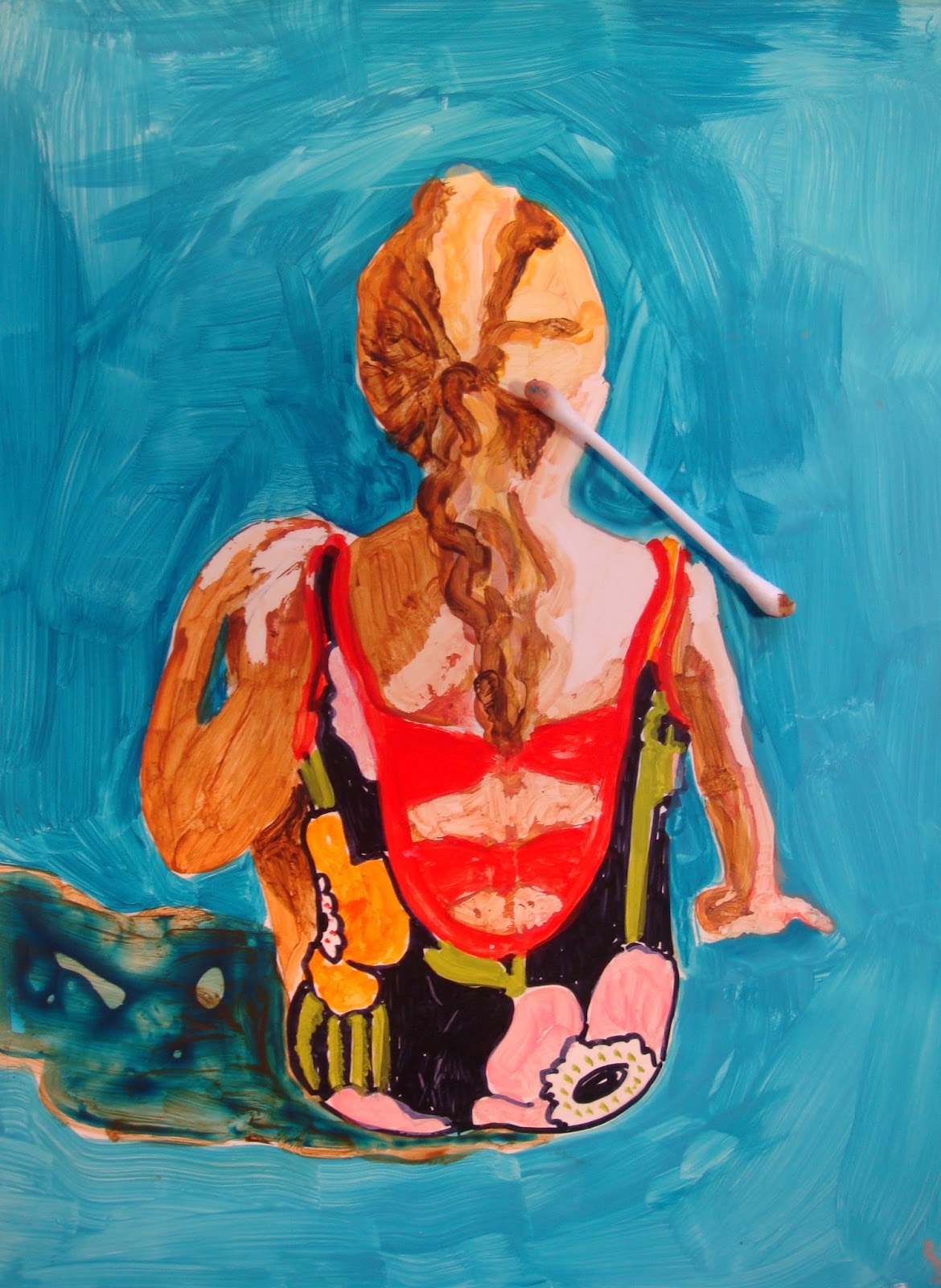
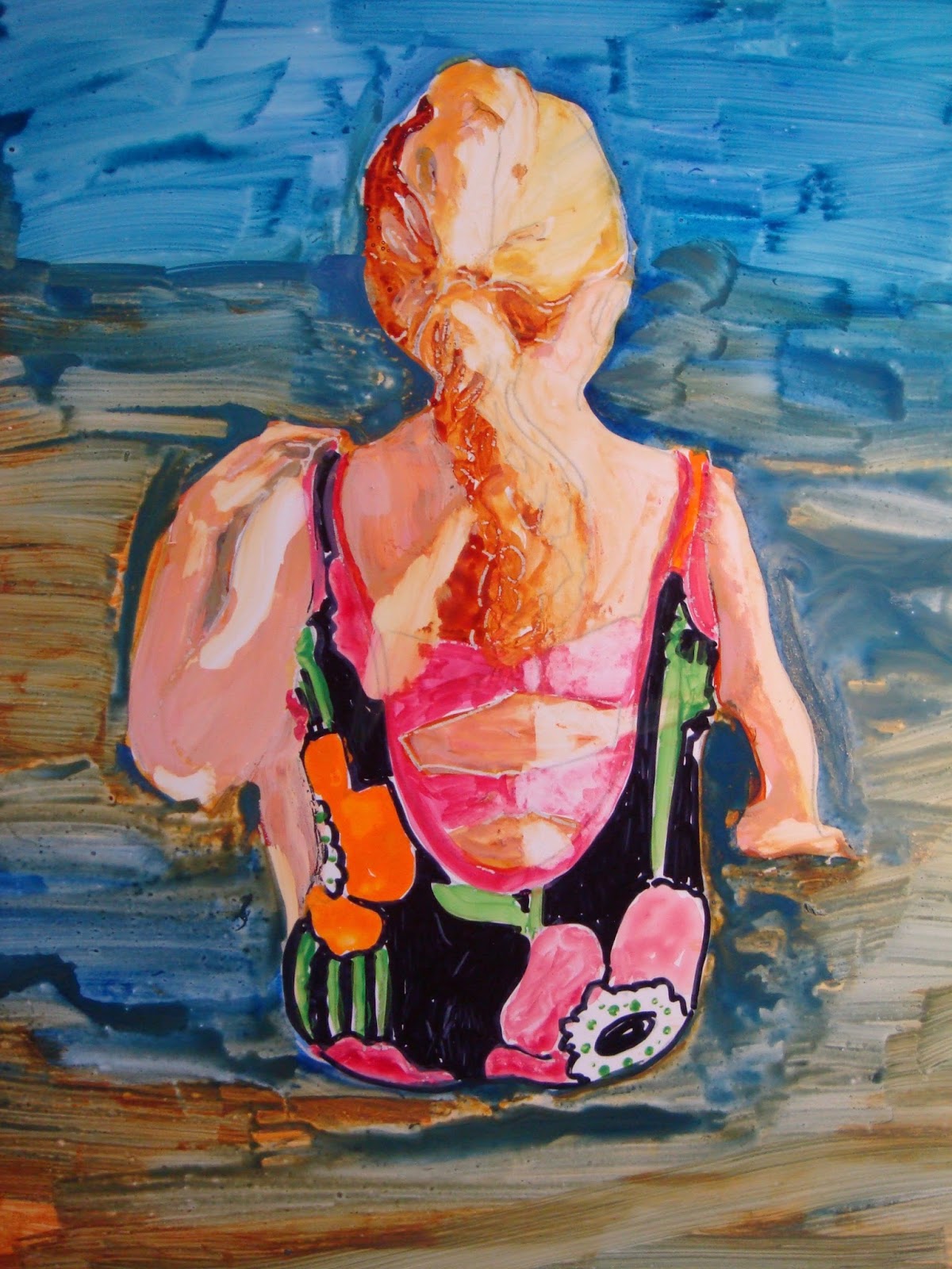
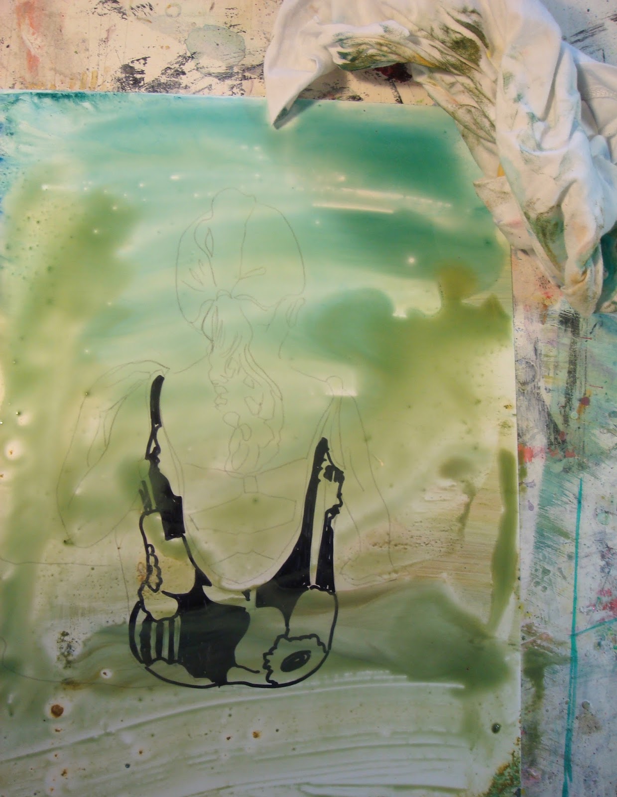
     This time I used acrylic paints on the same Yupo paper but I put my model into a vignette with a solid dark background, I got too confused with the ocean and the sand. Acrylics may adhere better to the Yupo substrate so that the glazing has a chance to work. Oh, the Vellum that Polly uses has arrived from Cheap Joe's. Vellum is more paper like than I thought it was.
2.


3.
After the background paint is dry I will start blocking in the figure with warm bright colors.


4.
I think I need to exaggerate the light and darks then do a wipe off of the lightest side. I did try a sample wipe off of the acrylics on Yupo...it works but not as well as watercolor paints. The Q Tip did a pretty good job of removing the paint on the light side of her body but I don't think it has the original pop so even though black is a no no, let's see what happens.
6.


5.


Forget the wash and move onto the last step.

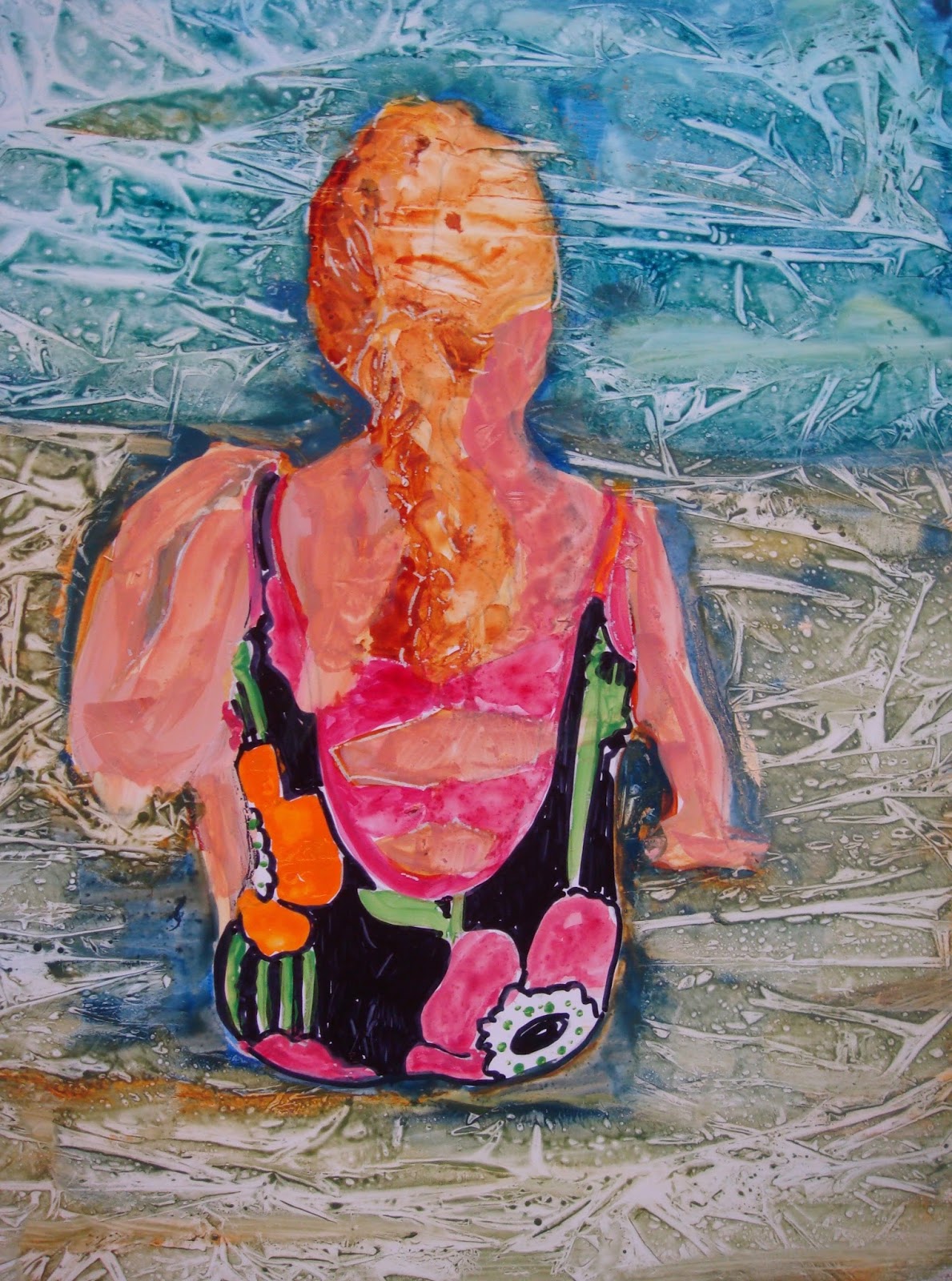
Completed.


Step 5. Colored Pencil Transitions.
Colored pencils are use to create soft edges or transitions from on shape to another. Of course the hard edges are left on the focal subject matter. Pencils are used to draw the details of eyes, lips, jewelry and other smaller details. If you leave all the solid color shapes they are perceived as "flat" in the painting.

I did not try to soften any edges just enhance features of the painting. I found that watercolor pencils worked better than regular colored pencils on the Yupo paper. I don't really know how to work on Yupo so my next attempt will be on Vellum.

Ps. I tried another painting on my newly ordered Vellum and found it is strictly for dry pencil drawing. Water just made it buckle and watercolors would not move around at all.

Add another fact added to my body of knowledge.

Friday, May 6, 2016

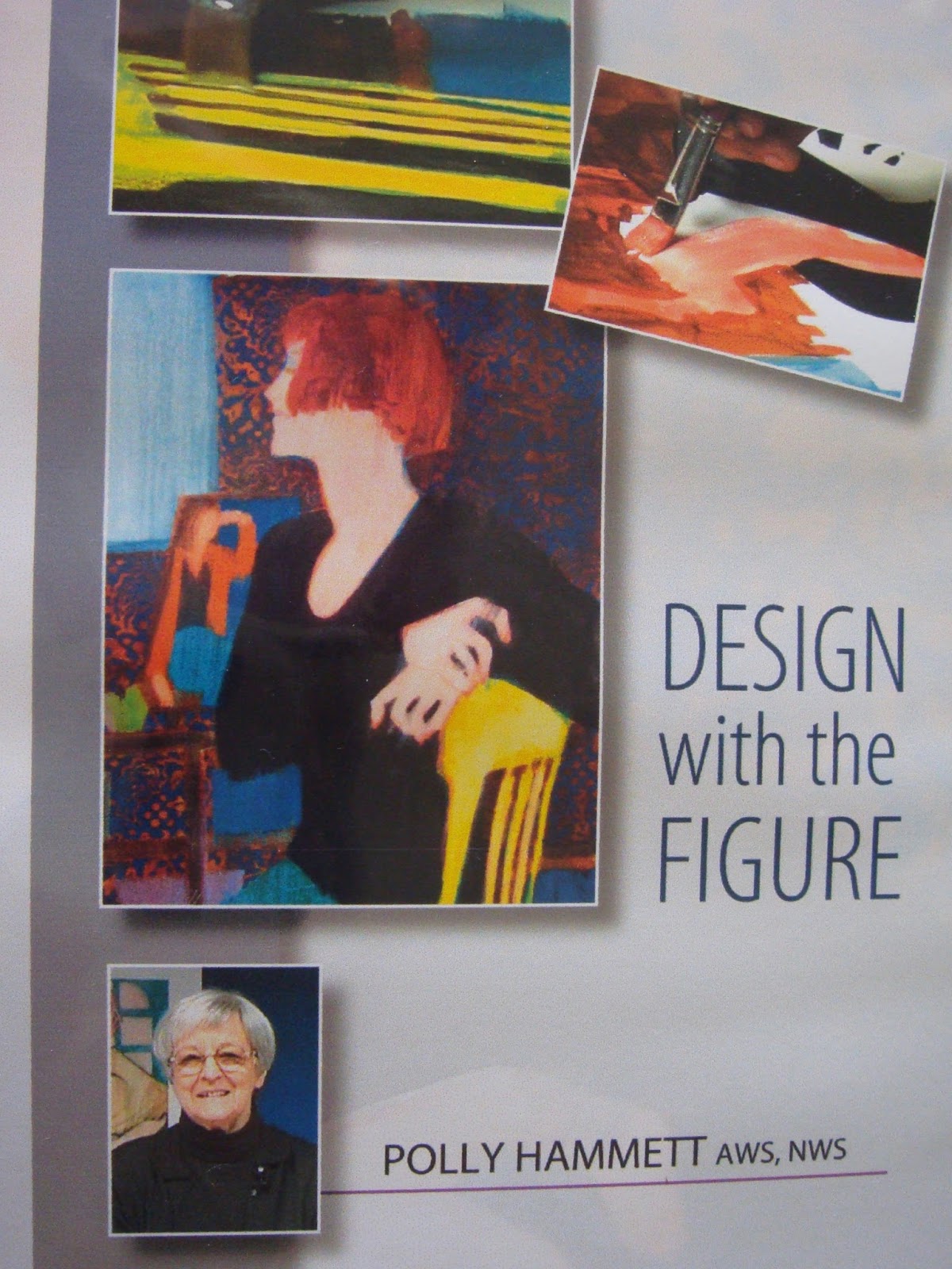
POLLY HAMMETT DVD REVIEW


     I finally have determined my style but I don't know what to call it; Flat Painting?
 While re- reading my art magazines I came upon an article interviewing  Polly Hammett and liked what I read. Next I U Tubed her and liked what I saw.

     Polly has a loose, simplified but dramatic style as she paints the human figure.  I have found an artist that I emulate so that will be my starting point. All of her techniques check off my boxes and all this time I have been trying to stick the proverbial round peg into the square hole.

     The next logical step is to order a book or DVD of hers to learn from. I may have missed it but I did not find a book but I did find her DVD Design with the Figure which I have played about five times while taking notes.

     Let me try to review the Five Step process that Polly uses:
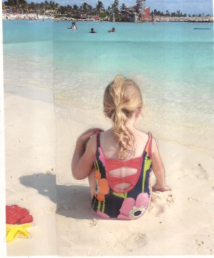
Photo: Laurel on the beach.

Polly uses live models that she sketches from and takes photos of. I am using my grand daughter as my model.


My value study.

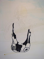
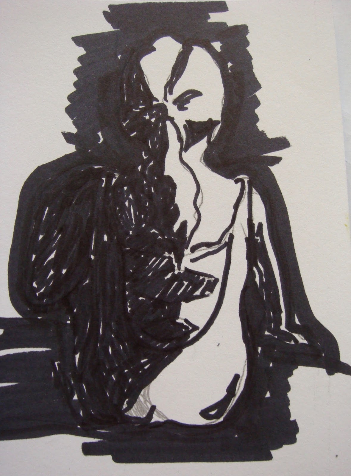
Step 1. Notan 
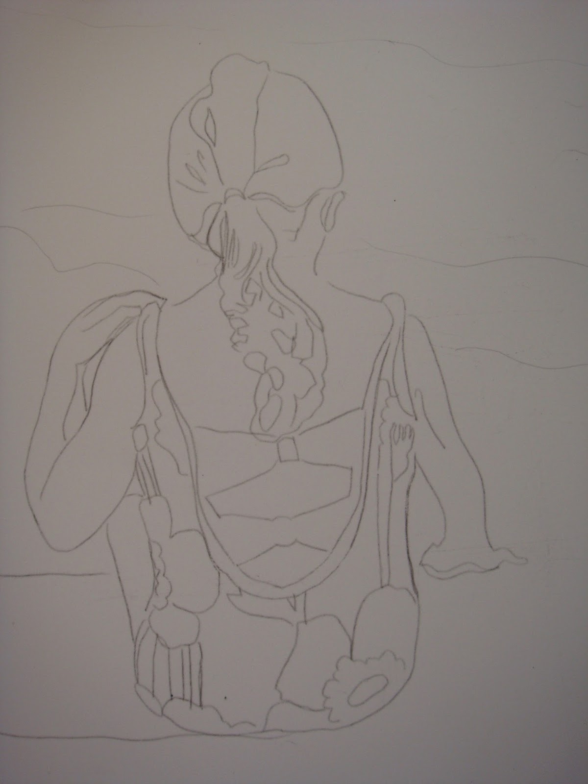
I enlarged the photo then transferred it onto Yupo.
Polly uses Vellum paper.


Make contour drawings which are turned into several 2 value studies to see which one pleases your sense of design. Here I have one dark / one light ratio but with a more intricate background you could have different number of light to dark ratios. I found it difficult to not mark in the local shadows of the photo. Polly says to not focus on the "things", instead go for the value shapes.
First attempt at blocking colors.

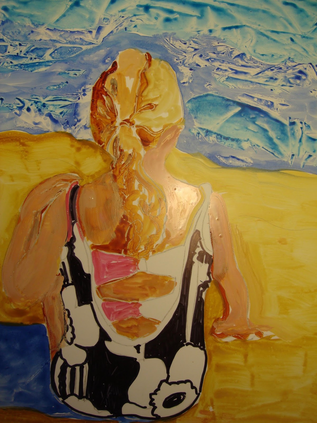
Step 2. Block in Color

     Using thick watercolor paint and a flat brush paint in the darker color values leaving the lights of the  focal point. Mid tones fall into the dark value. Forget local color and local values...this is a tough concept for me to do. Each new shape gets a new color. Polly lets her color choices have free rein, whatever color she likes she uses. That alone frees up some of my brain cells to make painting more fun. It is a process of warm vs. cool color contrast.


Step 3. Reclaim the Lights
Using a clean brush with clean water re-wet the light areas of the painting then swipe off the paint with a tissue or paper towel. This is nerve wracking after you put all that attention into blocking in the colors but it does make the colors sing. 
First Swipe.


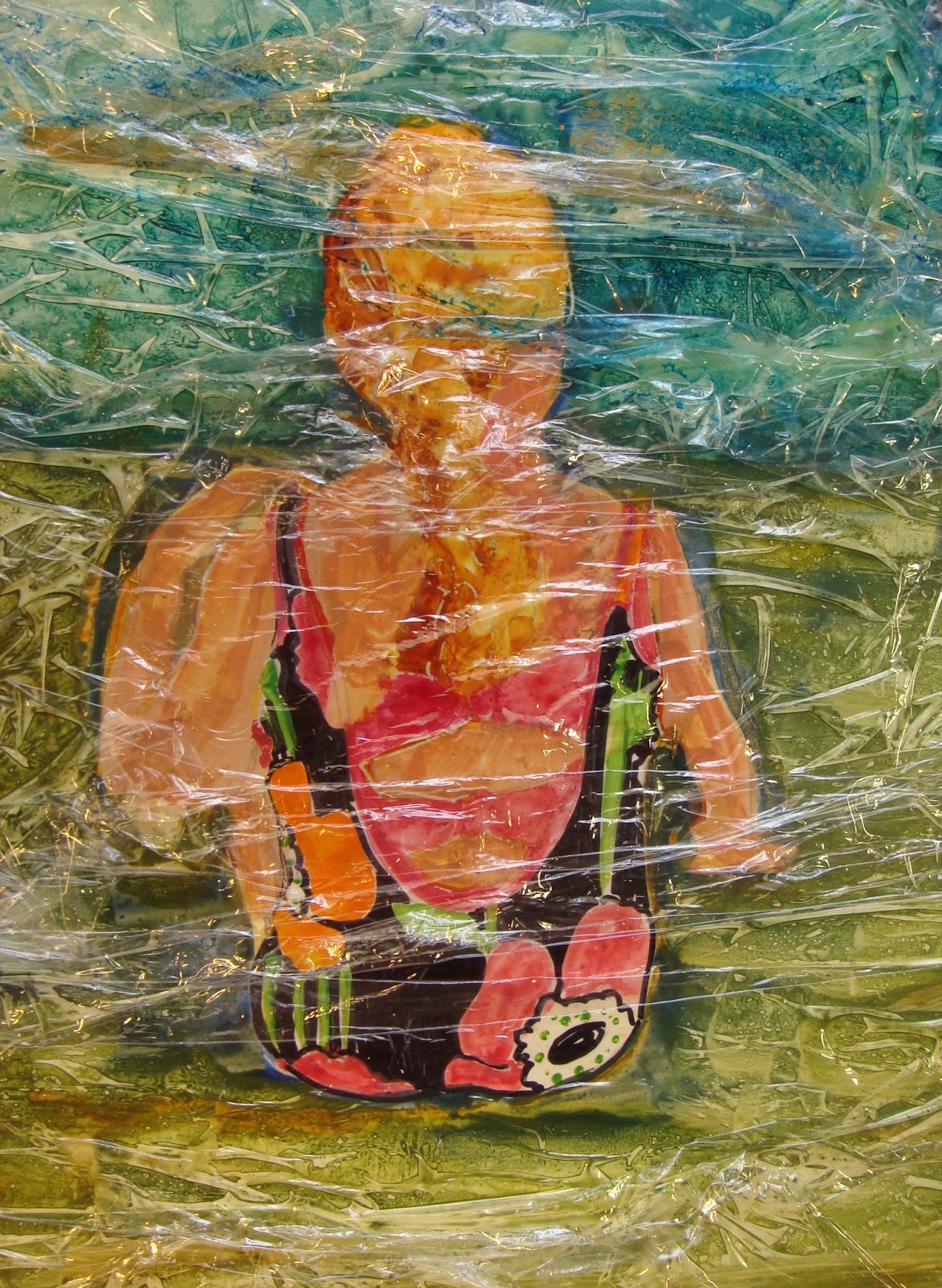
Adding pattern with ClingWrap. 

Remove Cling Wrap.

Adding pattern to add interest.
Polly places wax paper over the painting cutting out the areas she wants to stamp a design for interest and contrast. Add a thick layer of paint onto the stamp and place over background dark areas. It should be a different color but within the same value and color temperature.

Step 4. Glazing 
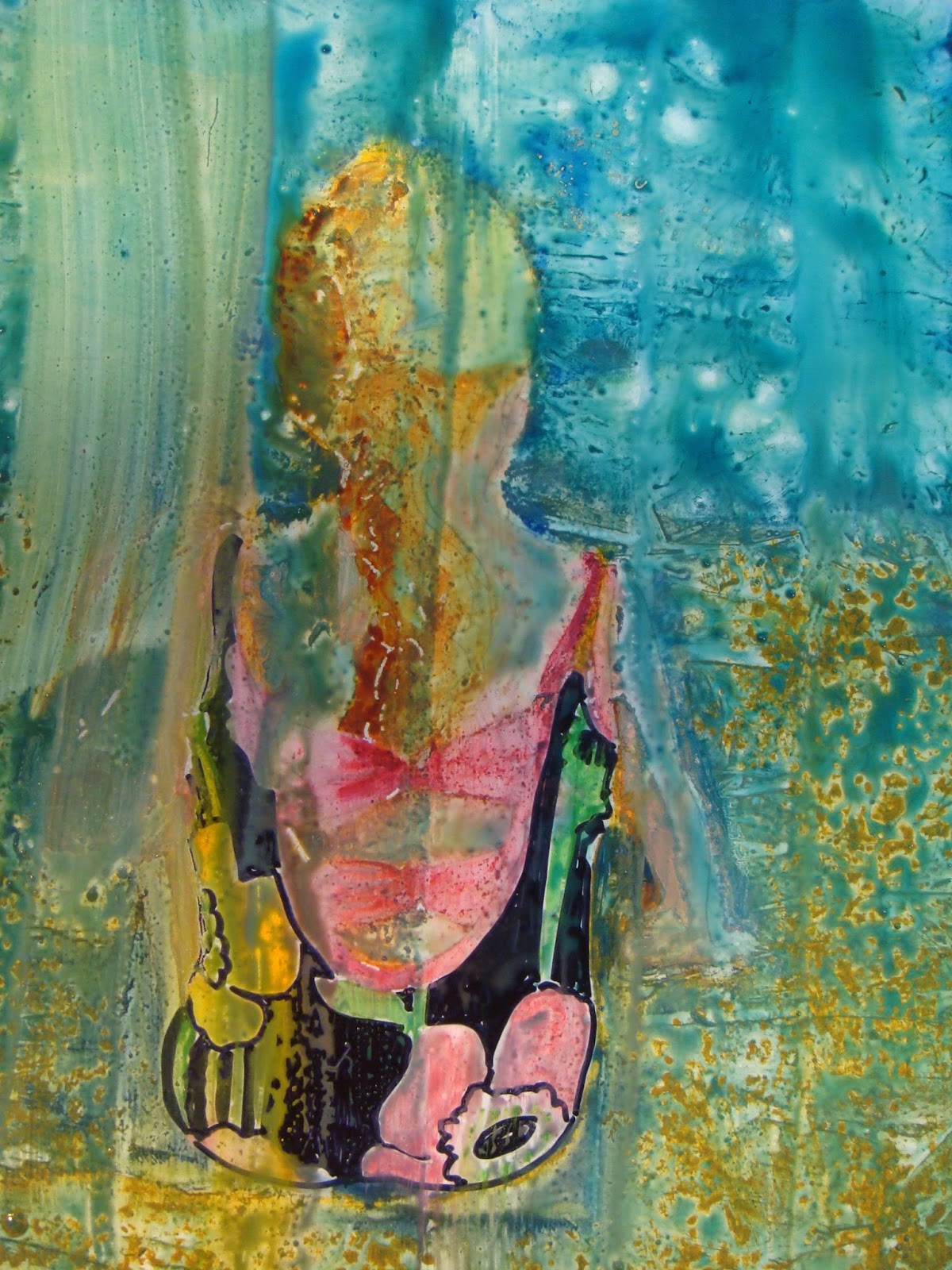
This took me totally by surprise! Polly glazes over the whole painting with a watered down blue, green, yellow or even an Opera. It unifies the painting but I sort of liked it before the glazing. One swipe of the paint brush or all the colors with dissolve and you have mud.

All my work died right in front of my eyes.  Thank heaven I can wipe it all off and start over with some experience behind me. I do enjoy experimenting with art techniques but I hate failure. Maybe I will skip this step in my next try. If I had used watercolor paper I think this step would have worked.


FAILURE :(

I never got to step 5, the fun part.
And so I will try again maybe using different surfaces such as watercolor paper or vellum (on order) also acrylic paints might work better for me.


Friday, April 29, 2016

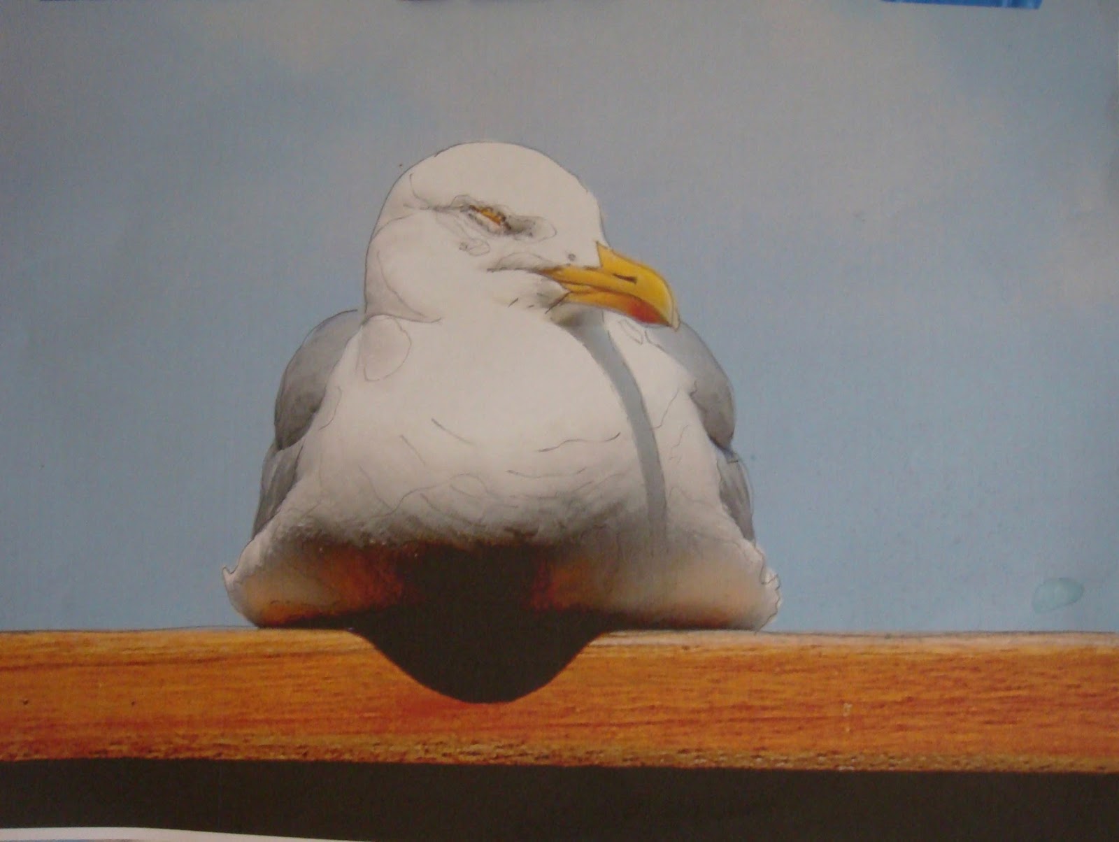
SLEEPING SEAGULL


Morgue File Photo


watercolor-step 1


mixed media-step 2


Using watercolor paper I painted the sky, bird, roost and drip technique. (Step 1)
Next I added Japanese Rice Papers to accent the seagull white feathers and wooden roost.


To make sure the rice paper did not peel off I gazed it with Acrylic Glazing Liquid. Off to the porch to photograph my newest creation.

Think I will try it oils or acrylics just  for fun.
Please check out Daily Paint Works to see it listed for sale.


I am always on the search for photos that appeal to my sense of artistic style. Somehow while deep in the rabbit hole of the computer I discovered www.morquefile.com where anyone can use a photo as a basis to create their own art work without copy right infringements.

        "Looking for high resolution stock photos for your illustration, comp or design needs?   Search        morgueFile for free reference images. Yes, they're all completely free. whether you're an illustrator, art director, instructor or looking to add a defining visual to a presentation."


Saturday, April 23, 2016

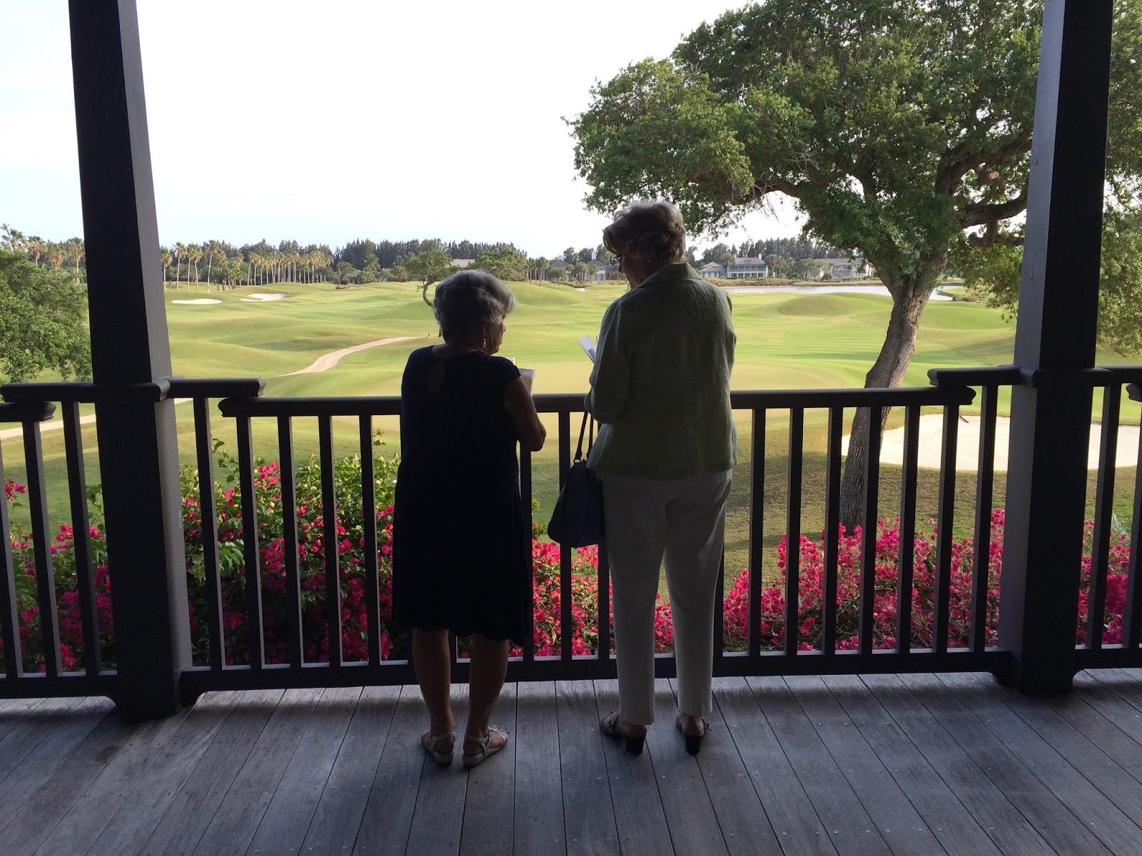
THE GALLERY AT WINDOR

Overlooking the beautiful golf course at Windsor.

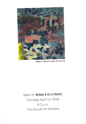
The Gallery at Windor presented  Salon IV:Art in History featuring the Danish artist Per Kirke's "Echo of the Light".
     A small group of people were introduced to Per Kirke's works by Dr. Richard Shiff of the University of Texas. Dr. Shiff pointed out the symbolism of Kirke's art with his knowledge of geology formations. The power point presentation was invaluable for me to see the parallels.

     On my own I never would have seen the the rock planes and striations in the art work. I must admit it was an esoteric lecture and equally esoteric art work. 
Maybe an acquired taste.

     Admittedly I am not on the same intellectual level but I thought most of the works were...shall we say, interesting.

     I felt that if I had painted such art it never have been accepted into any gallery but fame has a special lens of criteria.  This is only my opinion and I readily acknowledge my lack of an art history education and lack of desire to be in an insular bubble of artistic intellect.

It was a lovely day spent at Windsor even if I had a slightly negative opinion of the subject matter. 
The grounds and building architecture were marvelous.


Friday, April 15, 2016

MARY GARRISH DAY THREE

Mary with students at lunch.


DAY 3: 
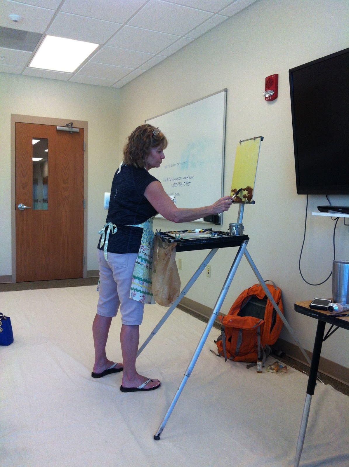
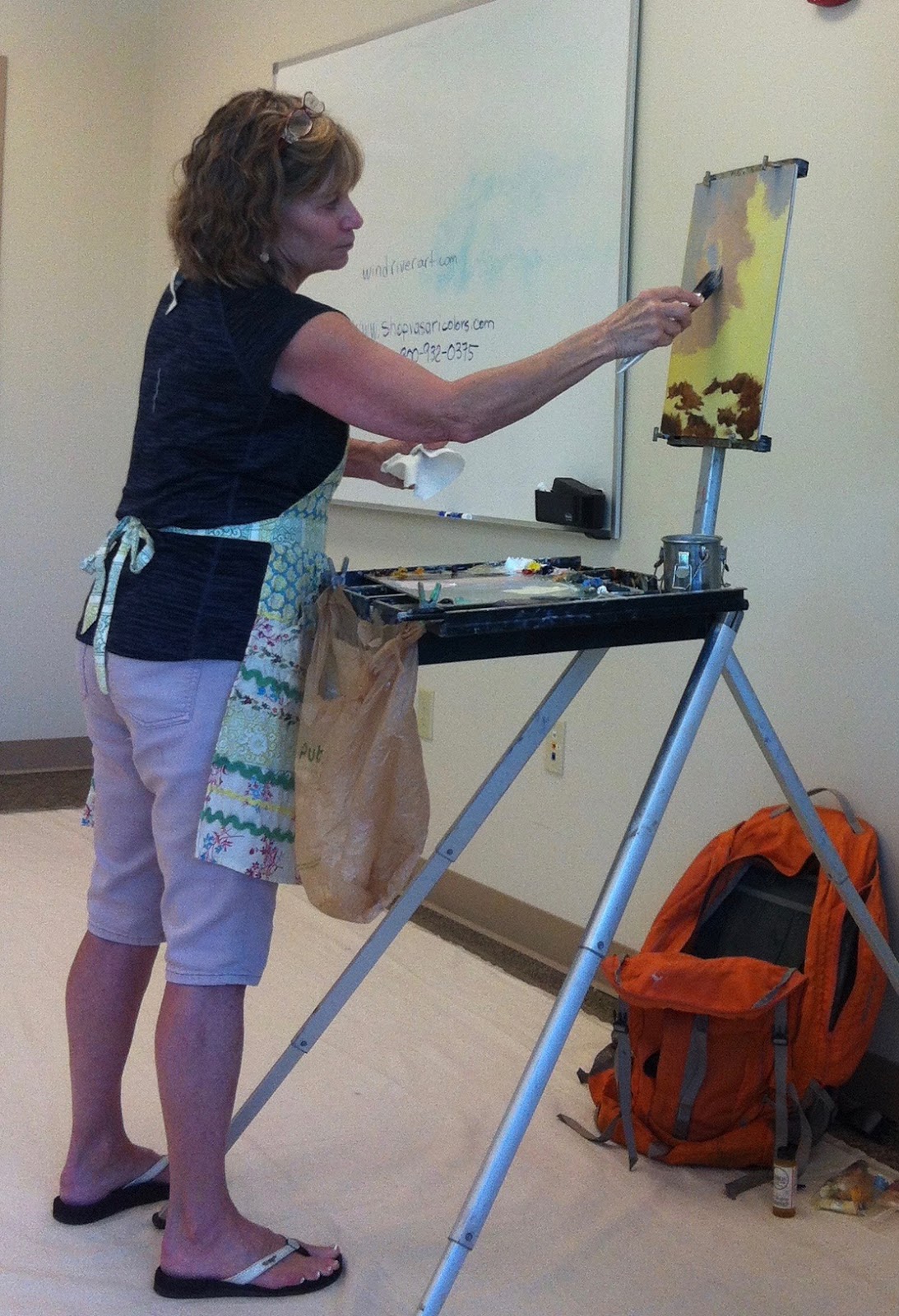
     Once again we met at the marina to paint during the best light of the day. Mary made sure to mentor each of the students with their paintings. 
      After lunch we went back to the classroom for a wrap up demonstration reviewing the concepts she taught.

Mary had a cool method to make sure we only use no more than five shapes in a painting. Take a photo of a scene you want to paint, outline 3-5 shapes with a Sharpie. Maybe even cut out the shapes to check on your design. 

Topping off the workshop Mary demonstrated painting ocean waves plus completed the following sky/ water scene. 

I never would have thought of yellow water but it reads well when all is said and done.
Beginning.
Middle.

Mary's luminous painting.
The End.


Saturday, April 9, 2016

MARY GARRISH DAY TWO


Day 2:

     The weather man predicted some percent of rain each day for our plein air workshop but the
weather gods saw that we were good people so the rain held off long enough to give us good morning and early afternoon to paint.

     At 8:00am we met on site near a local marina which offered sky, water, boats and mangroves to visually dally with. I've painted there before but was always over whelmed by what to paint. To me it was green and grayish green water everywhere but not one inspiring scene to paint. After walking around with Mary I now see so much that would make a great painting. It truly is in the eye of the beholder.

   
Under the bridge near the marina.
                                           
 Here is a bullet summary of day two:

* Mary uses Arches Oil Paper to do design paintings. The next day I was on line ordering some from Cheap Joe.
*Sunrises are pink & yellow.
* Sunsets are orange.
* She uses windriverart.com for her brush source.
*Premix all the paints you will need on your palette before you begin to paint. Make a pile of dark and light of each color. Later in the painting you can warm it up or cool it off when needed.
* Dry brush paint reflections vertically.
*Ripples on water are horizontal.
*Baby Wipes are good to clean up brushes and palette.
*Prepare a "battle plan" before starting a painting.
    (do thumbnail sketches or notans)
*Reflections in water from an object are the opposite value and chroma as the object.

     The biggest tip for me is to add temperature changes of similar values in a space or object.(sky, clouds, trees, water, land, etc.) This simple trick makes that area vibrate.

I am still learning when to shift the chroma and value as I paint. Mary talked a lot about this but it has not sunk into my brain yet.

     Oh, another big tip was always look for the light source that will determine the shadows, reflections and high lights of any shape or object. I was a science teacher, you think I could handle that one. An example would be the top of an ocean wave crest is light in color as the sky light hits there more than other spots on the wave.

Someday I will be a great painter....I just know there is a pony in here somewhere!