Saturday, October 25, 2014

SHOTGUN ART

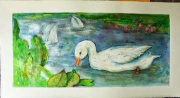
Realism Watercolor
     Call it ADD or extreme curiosity but I am fascinated by so many things in this world. I have had my Oriental phase, Abstract phase, Figurative, Whimsy or whatever sparkles in front of my eyes at the moment.
This was the main reason I call myself an "Eclectic Artist".

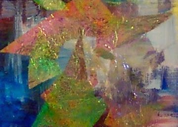
Abstract Mixed Media
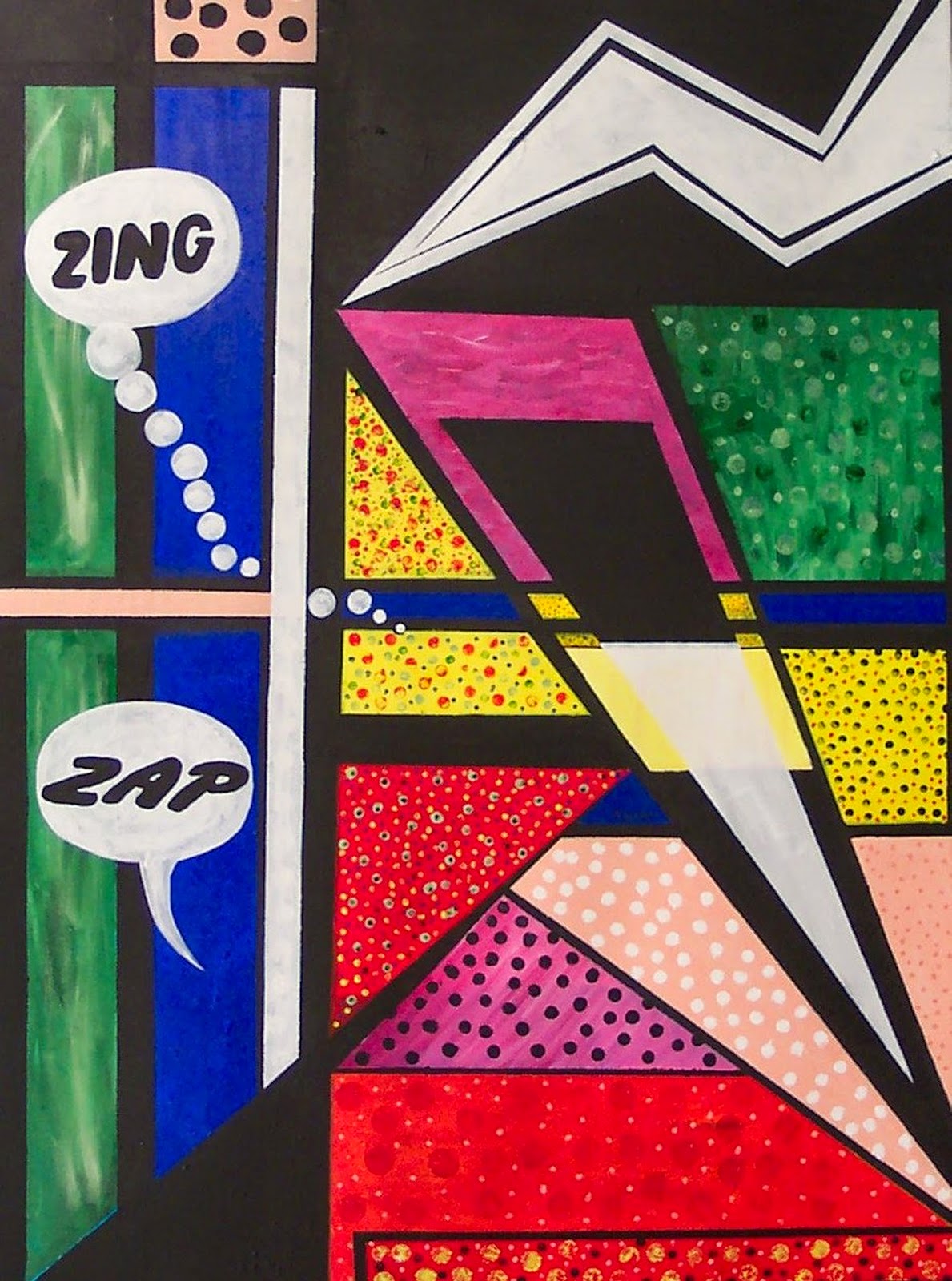
Acrylic Whimsy
                                                       
     All advice given to me is to perfect one genre so that I can brand my art work and people will easily recognize a Koser Original. I am aware of this marketing technique but I don't paint for sales, I paint for me and my goal is to be an exceptional artist. I have a long way to go but I am actively engaged in the journey.


 http://www.verobeachartclub.org/gallery.php   koserme@gmail.com     Google+

Wednesday, October 22, 2014

HOMEWORK COMPLETED

BLOG ENTRIES UNFINISHED:

I TOOK AN ARTISTIC WALK ABOUT
 & CHINESE JOURNEY SERIES-PANDA SANCTUARY.


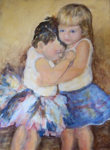
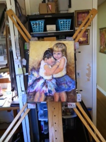
COUSINS
     If you follow my blog at all you know that I had not completed the Red Bench and the two children paintings. Part of the problem was that my
 I Photo had frozen and I could not upload pictures of my art work.  I tried everything I could think of then  called for tech support and magically it was fixed. This was painted in low light and I won't know the results until it is hung on someone's wall or in a gallery so no lesson learned here.


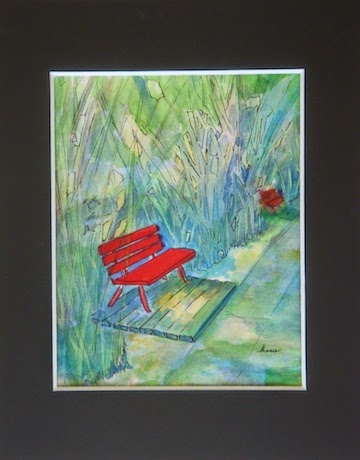
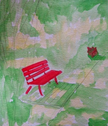
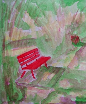
    I also finished the China-Red Bench that I started a blog or two ago. I was using neutrals to enhance the bright red of the bench. When I left it was in that; "ugly painting" stage and I honestly thought I would chuck it out. Using pen and ink I added detail and punched up the contrast with blue plus I tried to use negative space painting to give the illusion of bamboo. Put a mat around it and it isn't half bad. 
RED BENCH
LESSON LEARNED:
Wait a day or a week before giving up on a painting.

Sunday, October 12, 2014

I TOOK AN ARTISTIC WALK ABOUT: Painting in low light

I know my assignment was to finish or redo the Red Bench painting. The neutrals that I used really did not work for me and I will finish it in due time.

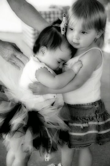
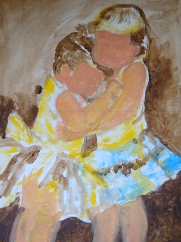
A friend asked me to do a painting of her grandkids which called me away from my task at hand. I have decided to take a journey down the human figure path as I also practice my newly learned lessons.

 The lesson I am combining with this project  is painting in a low light.
 I have noticed that some of my work looks great under my studio light  and then at an art show location not so much. Art shows and some galleries have notoriously poor lighting for exhibit paintings properly.

Would I be further ahead to paint in less than perfect light in order to compensate? I am trying to paint in just day light without the aid of full spectrum artificial lighting.

#1
This painting started with a monochromatic palette in mind but somehow it morphed into a little bit of color. Be still my wondering paint brush.

The color does seem to be more intense so maybe the low light thing works. I will try a few other paintings to see if the same holds true.

Final Painting
The last photo is my finished product with one eye a bit askew. I will work on that before giving it to my friend.
 Somehow my I Photo importing has frozen up so I could not edit my final product. Forgive me but I must dive into the bowels of the Mac to try and figure this out.

I enjoyed the process.


Please follow me on:
 http://www.verobeachartclub.org/gallery.php           Google+

Sunday, October 5, 2014

CHINA JOURNEY SERIES- PANDA SANCTUARY


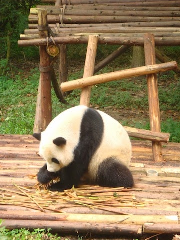
Part of our China journey took us to the Panda Sanctuary located just outside of Chengdu. We were told that this is the largest population of live pandas on display in the world. The 3 panda clubs were the most adorable fuzzy things ever.


My goal with the photos that I took was to capture scenes that I thought might be good material for watercolor or acrylic paintings. One of the photos was of a bright red bench surrounded by wispy bamboo shoots. If I take photos of scenes that are design balanced in the raw state I have solved half of the problems of painting good art work.
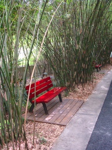
My photo

I am planning on doing the Red Bench in watercolor and try to combine it with a lesson on using neutral colors to emphasize the brighter hues around them.

RESEARCH:
I recently read an article by Steven Quiller in Artist Magazine where he gives instruction on how to mix the proper neutral that will harmonize with a specific painting.

His basically states that..."Using semi-neutral and neutral colors with some carefully selected brighter colors brings the painting to life". Quiller achieves these neutral by mixing the colors of the palette used in the painting with their direct compliment or  a pair of colors to either side of the direct compliment to get the proper neutral.

MY ATTEMPT:
Obviously bright red is the bold color so now I have to mix harmonizing neutrals to use in the bamboo surrounding the bench.
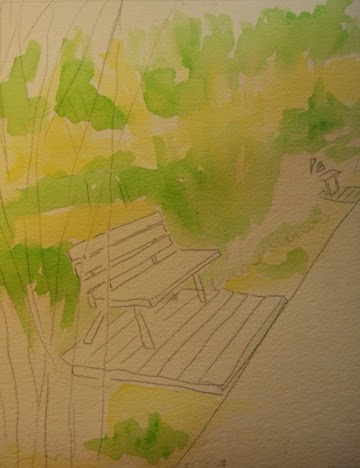
Sketch and first color

My limited palette will be yellow, yellow-green and red. Using a Quiller  color wheel I chose my compliments to create neutrals from the original palette. Yellow uses ultra marine blue and yellow-green uses magenta.
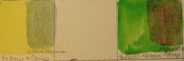
Applying compliment


 I used the glaze technique to apply the complimentary color (magenta) to the green. I will leave the yellow as pure color to show peeks of sunshine through the bamboo. Some more testing is needed with other compliments to the yellow green to give more depth to the painting.
RESULTS:                                            
Well...., I will work on this some more and show you the results next week. Maybe mixing the paints before on the palette would give a more pleasing result.

Please check out more of my art work on my web site:
http://www.verobeachartclub.org/gallery.php   koserme@gmail.com   Google+
Thursday, September 25, 2014

I WENT TO CHINA. DID YOU MISS ME?

My husband and I  took a bucket trip to China / Tibet for three weeks. We traveled with Overseas Adventure Travel which did a fabulous job but I have some serious jet lag right now. I know for sure that if I cannot fly first class on any future transcontinental flights, I will never travel again.

The trip was more arduous than I expected but I managed to traverse  Tiananmen Square &  Forbidden City, walked up the 250 of the 800 steps of the Great Wall with arrival jet lag (I have the walking stick to prove it; made in China).  Survived the high pitch of the Beijing Opera using a little secret; I wore ear plugs:)


 I saw the Terra Cotta Army and stayed overnight with a Chinese family in Hu Xian Donghan Village.
 Intrigued by languages I used my Che Che( "thank you"), Ne Hou ("hello") and Wo bu hou ( "I do not want") all over China. Oh the noodles and rice with sweet and sour pork. Did try a taste of the  yak butter tea and ate yak meat but yearned for a cheeseburger.

I walked my way up to the Panda Sanctuary which had three adorable baby pandas on display.
There were four internal flights on the trip plus the government did permit the tour to go to Tibet. In Lhasa I climbed  another 325 steps up to the Potala Palace in the rarefied air of 12,000 feet above sea level.  Each adventure I get slower and slower climbing the stairs. All the temples use very heavy incense so I ended up wearing a nose/mouth mask as we toured.
 

Next spent 3 days on a Yangtze River cruise ship.  Visited a family displaced by the Three Gorges Dam, went to see  the Gorges and one hanging coffin in the steep cliff.
Took a Hong Kong City tour which was beautiful at night. We shopped much less than the other seasoned travelers but did get gifts for the kids and grand kids.


Coming home I traveled through three airports, crossed over a date line and changed several  times zones but over 24 hours later I arrived home.  
There's no place like home!!

Sunday, August 31, 2014

COLOR CHANGE INSTEAD OF VALUE CHANGE CONTINUED.

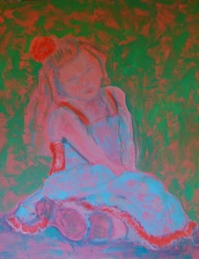
Here is my painting of a child update.
     I am going to critique my own work and would hope that others will add their constructive opinions.


* the shoes are too dark and pull away from the over all focus point of the face
* the blonde hair should have more color variation ( pull in some of the background color)
* the facial features are too stiff (use more soft edges)
*the dress needs to be more intense to hold its own with the rest of the painting
* the hair flowers need a dark edge at the bottom so they feel grounded

Your Turn:
*
*
* Thanks

www.verobeachartclub.org      Artist Gallery
koserme@gmail.com
Google +

Sunday, August 24, 2014

COLOR CHANGES INSTEAD OF VALUE CHANGES

     Watermedia Focus Workbook, Christopher Schink;... " employing color and intensity changes rather than using strong value changes. To keep the interior of shapes interesting I've alternated areas of warm and cool hues and bright vs neutral intensities".

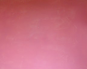
Pink Under Painting
Today I want to paint a child in a free painterly style using the warm cool shift instead of the value shift. The color choices are more symbolic that realistic, in other words it will not look like my granddaughter in the photograph.  My focus will be to use warm and cool color to get my message across.

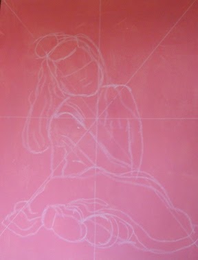
Enlarging the image
For the second step I used white chalk and a diagonal grid to draw a larger version of the photo.


Next I blocked in the cool colors and I am still using the Lori Snow-Hein limited color palette.

It is slowing taking form but I feel I am losing my original color focus. The background color still bothers me but I can't decide what cool receding color to use.


 I'm lost but will not give up.
I have no clue when using color instead of value flew out the window and I just kept on painting! The painting of my granddaughter has morphed into a more realist style than I had in my mind when I  started out. This will not be a finished product by my self imposed Sunday publishing date but I'd rather take my time and be pleased with the results.
To be completed at a later date:)
Please check out my web site at: www.verobeachartclub.org