Saturday, February 28, 2015

Vero Bach Art Club Presents a John Traynor Plein Air Workshop


John Traynor Plein Air
                         What a wonderful but tiring two days it has been! 
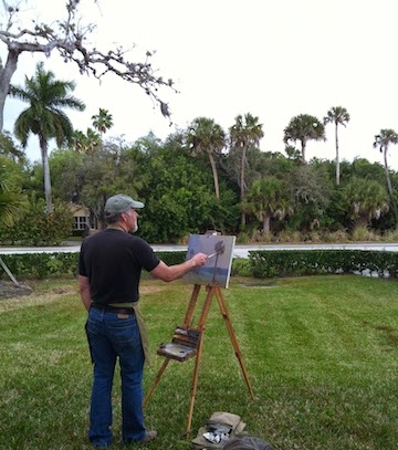
Nationally known oil painter John Traynor came to Vero Beach to attend a reception at the Stringer Gallery of Fine Art where his work is being exhibited.  Mr. Stringer recommended John Traynor as an instructor for one of the Art Club workshops; an invitation we warmly accepted. 

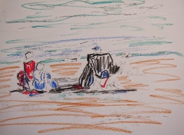
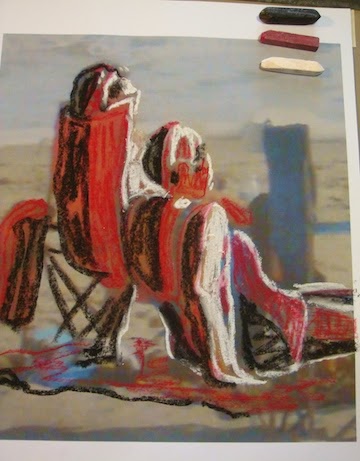
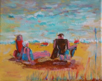
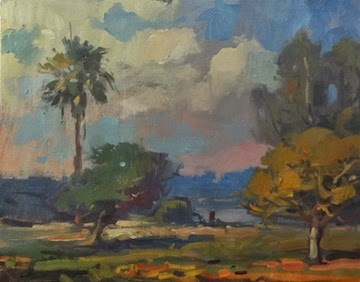
The first day we met at a county park to paint. John did a lengthy informative demonstration of an ordinary scene. All I saw was green, green and more green but Traynor turned it into a work of art.

The day started out cloudy and slowly the sun came out as he was painting and so the final product changed right before our eyes. I now do not fear the vast green of painting plein air.

There was so much to learn that I'm having trouble retaining it all. I did take notes so I will try to summarize his demonstration/lecture.

*There are two progressions in a painting; side to side and front to back.
*He paints all over the picture so he doesn't finish one section before another.
*He primed the canvas in a gray violet which depicts the moisture in the atmosphere.
*Warm & dark in the foreground.
*Adding white (opaque) will cause object to recede.
*Put a piece of cardboard on the back of your canvas to prevent back lighting on your canvas.
* Temperature changes are linked with value changes. Temperature is a road map to perspective of a landscape scene. Each ground zone has a particular color/temperature.
*Morning has pink at the horizon.
*Mass shadows and shapes  in a darker neutral tone to begin.
*Warm atmosphere light yields cool shadows, cool light yields warm shadows.
* Shadows are darkest just under the tree and lightens as it goes away from the object.
*Morning and evening has warm atmospheric light, mid day has cool light
*Treat each tree or object as a separate element with a fore, mid and background and change the temperature of the color accordingly.
*Each of the three sections of the painting have a specific color temperature mixture.
*Soft edges recede, sharp edges come forward
*A busy sky should have a simple landscape and visa versa
*Traynor did color test samples to see if a color in his painting were correct. I still have to get my brain around this one.
*Yellow ochre is a mid tone color
* Transmitted light is light filtering through leaves so it is lighter and warmer in color.
* Use a violet for tree branches.

Next week I will write about day two of the workshop so please stay tuned.


koserme@gmail.com
Web site: www.verobeachartclub.org     (Artist Gallery)

Sunday, February 22, 2015

Taking a Lesson from Peggi Kroll Roberts


I  joined the Vero Beach Art Club Plein Air group to make sure I keep my weekly art days as suggested in The Artist's Way.
This is my first photo of beach goers on a sunny Florida day. It felt good to take the time for my art journey toward becoming the best painter I can be.

SUBJECT:

                   PRIME THE CANVAS:


While reading my newest issue of Watercolor Magazine I discovered an article; "Blueprint for Success" by Peggi Kroll Roberts. She is a proponent of simplified shapes, loose brushwork and expressive color which sounds delightful to me. I am using acrylic instead of watercolor but I'm hoping the technique will serve both media.

I am following her steps to learn from her style:
       *  Choose an appealing subject; DONE
       *  Determine light source and determine the darkest dark and the lightest light. DONE
       *  Create value and color thumbnail sketch ( I am so impatient; I dislike doing this step but here I go. The darkest dark is the back of the man's chair and the lightest is the foam of the ocean waves.
       *  Paint in 3 values with a flat brush, massing the shadows and simplifying shapes. I DID MASS THE SHADOW SHAPES AND NOW ON TO THE 3 VALUES
I tried something new with the 3 value thing; I cropped out individuals in the photo and will try to ID the values that I will use. I will also premix three values on my palette before painting them.
       *  Use expressive color.
       * Avoid an equal dark to light ratio.


SKETCH
MASSING SHADOWS
3 VALUE STUDY

Call it lazy but I rather like my idea of printing off an enlarged portion of my photo then drawing the 3 values over it. I tried colored pencil, Conte pencils and they did not work very well. Pastel chalks worked well and I did take some artistic license with the placement of the values.


Next Roberts masses the lightest parts of the painting.

MASSING LIGHT AREA
3 VALUE LOCAL COLOR

ALMOST DONE  
LESSONS LEARNED:  I do not do well painting small (8x10), the limited palette is working well for me and I liked the steps presented by Peggi Roberts. The final results leave a lot to be desired.
The value sketch of just the two women would make a better design to try.

Let's end on a high note; with practice I can paint simple, loose and colorful.
DONE #2

DONE #1

Saturday, February 14, 2015

ART ON THE ISLAND ART SHOW

RUSSIAN PEASANT DOLL- SINGING OFF KEY.
The Vero Beach Art Club had their first ever 3D art exhibition and it was a total success. The friday night reception was packed with people on the inside and the outside porch of the Marsh Island Club House.

The Art Club provided gourmet finger food, wine/beer tasting and live music! The weather may have been cold but it was hot in the Club House.  This was a venue where fabric and some other art forms were able to shine. The mixed media artists in the club seems to be growing and now they have their own niche to call their own.

The Art Club did not leave out the 2D artists, they were asked to think outside of the Art Box to make a 2D with Pizzazz. I was delighted with the creativity of some of these art pieces. The categories were sculpture, jewelry, pottery, glass, mixed media, fiber and 2D with Pizzazz.

I did not win a prize for my large gourd entry but    IT    SOLD:)

Sunday, February 8, 2015

PAINTING RISING FROM THE ASHES


     Way too many of my paintings go into the "wait and see if you can save it" or "gesso over the whole thing immediately" bin. Here is one that is riding the fence. It was a water scene for which I could never find a resolution. It has no focal point that satisfies me, the balance and design were off and I just did not like it.
Turn on the music in the studio; it helps me get into the zone.          
SOS!
Last week I started back into plein air painting with the Vero Beach Art Club. I was ill prepared and it was cold but I did get a sketch of some yachts at our local marina while sitting in the shade of a big bridge. Needless to say I only lasted an hour in the field.

I am trying to force myself to do an abstract of just the major shapes, this may help me not get into details and small brushes way before I should. I also used a credit card to do the mast straight lines because I cannot free hand a straight line to save my soul. The painting unknowingly has transformed into a bit of an aerial view.

Originally there were 5 sea gulls in the foreground of the water scene  with no appeal. Step 1 was to obliterate the birds with a complimentary orange color. My logic is that whatever compliment I painted over it would sparkle with the orange peeking through.   
I got a beautiful rose/gray neutral by mixing Thalo green with Cad. Red with a spot of white. At least I am more aware of using neutrals in a painting and I still use the limited palette of colors.
The two on the left are stages of my painting process and the larger photo to the right is the final product. No guarantee that I will not go back to soften up the orange and add a wee bit of detail.

 
SHADOWS