Friday, December 19, 2014

I SHOWED UP FOR THE BALL GAME!

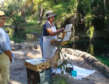
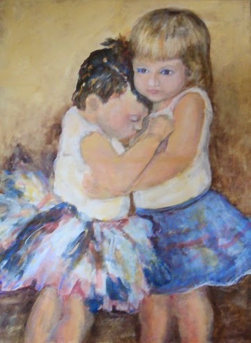
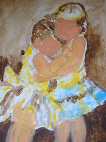
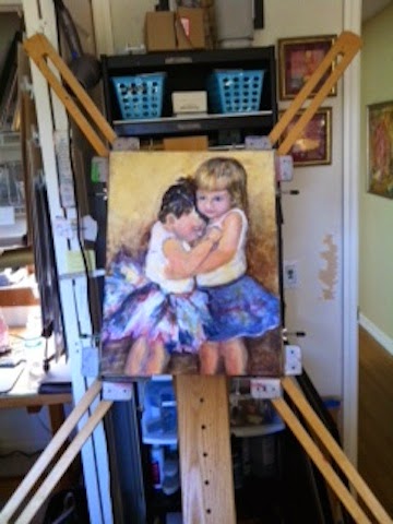
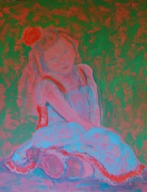
Just because I was taking a break from blogging it doesn't mean I took a break from painting. Here is a painting of my granddaughter which will be a gift to her parents.

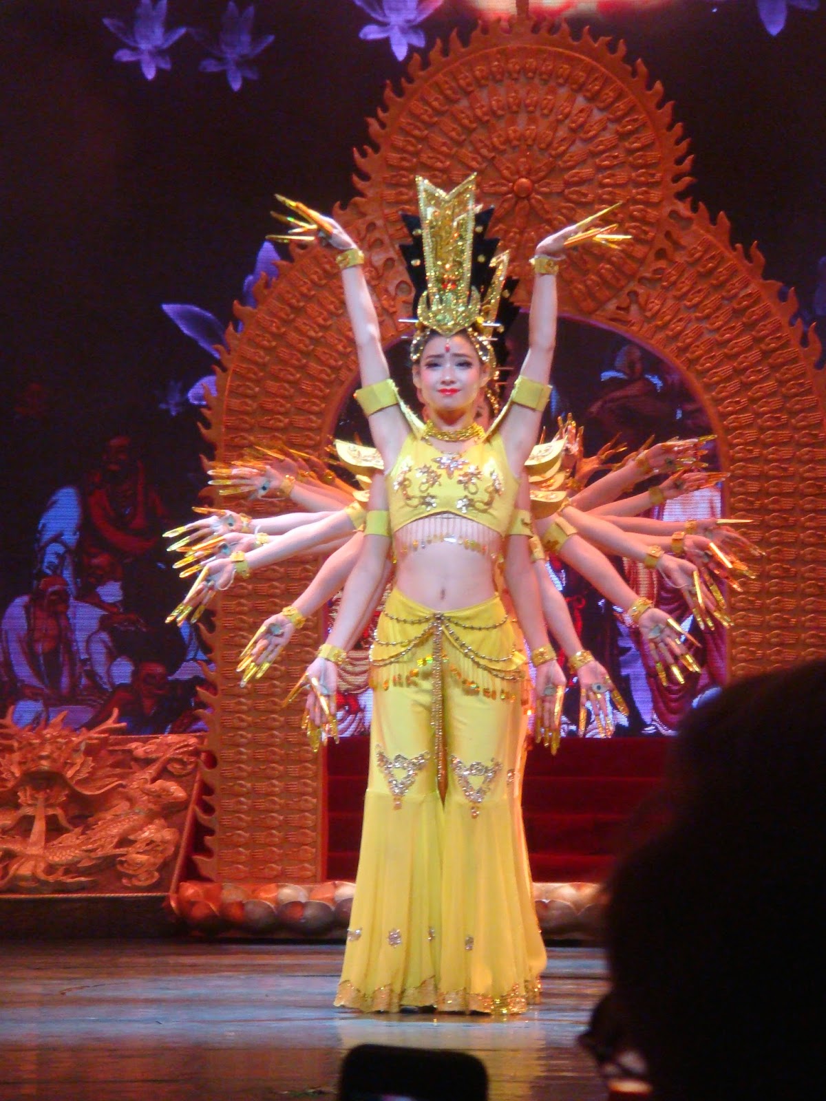
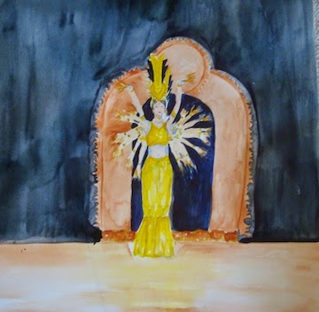
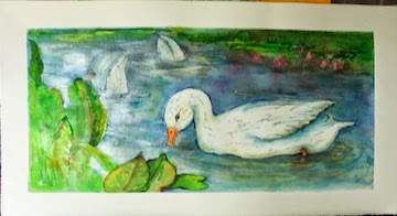
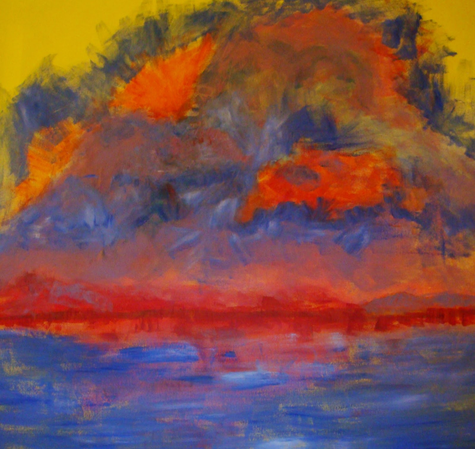
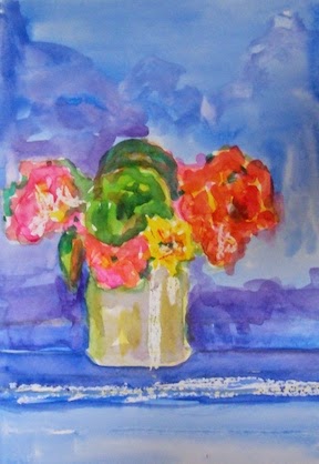
My title; "I Showed up for the Ball Game", means that I took 4 paintings into a local co-op art gallery to be judged in the hope that I may join as a member. They were very gracious telling me not at this time and were honest enough to share the group critique. I need to get a body of work that is cohesive of my own distinct style. That critique was sincerely appreciated.

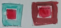
If you read my prior blogs it becomes apparent that I have been searching for  this artistic identity and will continue to do so. I asked myself what do I find the most joy in painting? Not the subject matter but the style of painting...at the moment I have answered impressionism or abstract expressionistic. The only problem is that many of the gallery members are doing the same style and I need to find a different interpretation so that my work stands out in the crowd of other wonderful painters.

I now have a specific goal. All of the swirling possibilities are slowly being narrowed down and that is progress, for this I am pleased.

Sunday, December 7, 2014

TOUCH OF WHIMSY


     I know I am on break but this bit of whimsy just popped out of me. It will be a holiday/ house warming  gift within the family.

Tuesday, December 2, 2014

PAINT AND PURGE

Cool Dude- Mixed Media
Every year I reach a point of frustration; where am I going to store all of these paintings? Or my better half mentions how much space I am taking up in the guest room and he is right.

 Then I begin with my: Why do I keep painting pictures if I have no outlet for them, why do I work so hard to once again reorganize my small studio to squeeze everything in? It is no longer squeezable.

I don't have a delete button so I go into purge mode to donate my art work. It is a good time to reevaluate the quality of my collection, get rid of the so so and set a higher standard for myself. It still hurts to jettison my creations but it must be done.

The other thing I can do is stop painting for a while. Don't paint for the sake of just painting but wait until a subject pulls so strongly on me that I have to paint it.

Taking a break.

Saturday, November 22, 2014

WHAT'S THE MEANING OF MY BLOG?


SUNFLOWER-seeking the light!
      I started blogging in 2009 just for blogging sake. Slowly it evolved into an art blog and now I feel the need to define my purpose and audience. First of all I write for me; the self imposed once a week dead line makes me be productive and my goal is improving my painting techniques.

    After reading art magazines or taking workshops,  I do the  suggested projects and write about the process on line.  That means my blog is focused on presenting my results and I am really honest about my success or lack there of.  To put a label on my weekly publication would be a Personal Art Journal.

     At the moment I don't have an audience but that's OK.  It would be great to expand my blogging to engage with other artists in constructive text conversations but I think I have to learn a new bag of blogging tricks before that will happen. If the world runs on give and take I would like to share my experiences and learn from those who wish to share their knowledge.


 http://www.verobeachartclub.org/gallery.php   koserme@gmail.com  google +

Sunday, November 16, 2014

ART ON THE ISLAND- SINGING OFF KEY

80% done
   The Vero Beach Art Club is creating a new show just to show off their 3D media members. I mainly paint 2D but am happy to leap out side the art box now and then.

    I have a source of big sized gourds that I  paint into a doll of some sort. Here is another Russian peasant that I will enter into the Art on the Island event in February 13-14 2015. It will be held on Marsh Island Clubhouse.

The love of bright colors and the bit of whimsy as a change of pace painting draws me in. Wish me well for the show and sell event:)

I see that the face is too large for the doll so I will redo it again. Live, take a photo and learn.
Russian Doll- Singing Off Key

Sunday, November 9, 2014

PLEIN AIR WORKSHOP


Instructor Karen Leffel-Massengill 

     It was a busy week, art club meetings then a Friday/Saturday plein air workshop. The weather was Florida winter wonderful for Friday and Saturday and then the rains came on Sunday. 

Friday we met on an ocean beach to paint waves hitting the sandy shore``karenleffel@comcast.net.
Saturday we changed locations to attempt our skills at painting a waterfall along a flowing stream. Karen demonstrated the "how to" for each scene and roamed around to give each student private attention. 

I had a delightful two days; tired yes but recharged to use my new knowledge. 

My goal is to grow into to my fullest artistic potential. 

Wednesday, November 5, 2014

China Series- Chengdu Opera

The Classical Chinese Opera was too loud and too high pitched for my western music background. As I mentioned before I had ear plugs on hand for my husband and myself.
This was a different opera and I found it quite enjoyable. The petite Chinese girls were the epitome of balance and grace with their precision dances.

STEP 1
I am attempting to paint this detailed photo first using only negative painting technique. Is it even possible to do a whole painting using only the negative space?
DANCERS WITH MANY ARMS
 During my weekly open studio painting I did the drawing of the photo that I had taken in China.
   
Next I began painting around all of the positive figures; in essence, negative space. My style is  loose & painterly but I have a feeling this one my be on the tight side.
STEP 2
                                                           
I am not pleased with this plus I am out of my comfort zone. I'm not sure if it because I am working in watercolor or because it is too tight for my liking.
 Every painting has an ugly stage boy have I hit mine. Negative painting is out the window and happiness is finishing this in time for my blog publish day.
 Didn't make the deadline!

More later as painting happens.
   

Saturday, October 25, 2014

SHOTGUN ART

Realism Watercolor
     Call it ADD or extreme curiosity but I am fascinated by so many things in this world. I have had my Oriental phase, Abstract phase, Figurative, Whimsy or whatever sparkles in front of my eyes at the moment.
This was the main reason I call myself an "Eclectic Artist".

Abstract Mixed Media
Acrylic Whimsy
                                                       
     All advice given to me is to perfect one genre so that I can brand my art work and people will easily recognize a Koser Original. I am aware of this marketing technique but I don't paint for sales, I paint for me and my goal is to be an exceptional artist. I have a long way to go but I am actively engaged in the journey.


 http://www.verobeachartclub.org/gallery.php   koserme@gmail.com     Google+

Wednesday, October 22, 2014

HOMEWORK COMPLETED

BLOG ENTRIES UNFINISHED:

I TOOK AN ARTISTIC WALK ABOUT
 & CHINESE JOURNEY SERIES-PANDA SANCTUARY.


COUSINS
     If you follow my blog at all you know that I had not completed the Red Bench and the two children paintings. Part of the problem was that my
 I Photo had frozen and I could not upload pictures of my art work.  I tried everything I could think of then  called for tech support and magically it was fixed. This was painted in low light and I won't know the results until it is hung on someone's wall or in a gallery so no lesson learned here.


    I also finished the China-Red Bench that I started a blog or two ago. I was using neutrals to enhance the bright red of the bench. When I left it was in that; "ugly painting" stage and I honestly thought I would chuck it out. Using pen and ink I added detail and punched up the contrast with blue plus I tried to use negative space painting to give the illusion of bamboo. Put a mat around it and it isn't half bad. 
RED BENCH
LESSON LEARNED:
Wait a day or a week before giving up on a painting.

Sunday, October 12, 2014

I TOOK AN ARTISTIC WALK ABOUT: Painting in low light

I know my assignment was to finish or redo the Red Bench painting. The neutrals that I used really did not work for me and I will finish it in due time.

A friend asked me to do a painting of her grandkids which called me away from my task at hand. I have decided to take a journey down the human figure path as I also practice my newly learned lessons.

 The lesson I am combining with this project  is painting in a low light.
 I have noticed that some of my work looks great under my studio light  and then at an art show location not so much. Art shows and some galleries have notoriously poor lighting for exhibit paintings properly.

Would I be further ahead to paint in less than perfect light in order to compensate? I am trying to paint in just day light without the aid of full spectrum artificial lighting.

#1
This painting started with a monochromatic palette in mind but somehow it morphed into a little bit of color. Be still my wondering paint brush.

The color does seem to be more intense so maybe the low light thing works. I will try a few other paintings to see if the same holds true.

Final Painting
The last photo is my finished product with one eye a bit askew. I will work on that before giving it to my friend.
 Somehow my I Photo importing has frozen up so I could not edit my final product. Forgive me but I must dive into the bowels of the Mac to try and figure this out.

I enjoyed the process.


Please follow me on:
 http://www.verobeachartclub.org/gallery.php           Google+

Sunday, October 5, 2014

CHINA JOURNEY SERIES- PANDA SANCTUARY


Part of our China journey took us to the Panda Sanctuary located just outside of Chengdu. We were told that this is the largest population of live pandas on display in the world. The 3 panda clubs were the most adorable fuzzy things ever.


My goal with the photos that I took was to capture scenes that I thought might be good material for watercolor or acrylic paintings. One of the photos was of a bright red bench surrounded by wispy bamboo shoots. If I take photos of scenes that are design balanced in the raw state I have solved half of the problems of painting good art work.
My photo

I am planning on doing the Red Bench in watercolor and try to combine it with a lesson on using neutral colors to emphasize the brighter hues around them.

RESEARCH:
I recently read an article by Steven Quiller in Artist Magazine where he gives instruction on how to mix the proper neutral that will harmonize with a specific painting.

His basically states that..."Using semi-neutral and neutral colors with some carefully selected brighter colors brings the painting to life". Quiller achieves these neutral by mixing the colors of the palette used in the painting with their direct compliment or  a pair of colors to either side of the direct compliment to get the proper neutral.

MY ATTEMPT:
Obviously bright red is the bold color so now I have to mix harmonizing neutrals to use in the bamboo surrounding the bench.
Sketch and first color

My limited palette will be yellow, yellow-green and red. Using a Quiller  color wheel I chose my compliments to create neutrals from the original palette. Yellow uses ultra marine blue and yellow-green uses magenta.

Applying compliment


 I used the glaze technique to apply the complimentary color (magenta) to the green. I will leave the yellow as pure color to show peeks of sunshine through the bamboo. Some more testing is needed with other compliments to the yellow green to give more depth to the painting.
RESULTS:                                            
Well...., I will work on this some more and show you the results next week. Maybe mixing the paints before on the palette would give a more pleasing result.

Please check out more of my art work on my web site:
http://www.verobeachartclub.org/gallery.php   koserme@gmail.com   Google+

Thursday, September 25, 2014

I WENT TO CHINA. DID YOU MISS ME?

My husband and I  took a bucket trip to China / Tibet for three weeks. We traveled with Overseas Adventure Travel which did a fabulous job but I have some serious jet lag right now. I know for sure that if I cannot fly first class on any future transcontinental flights, I will never travel again.

The trip was more arduous than I expected but I managed to traverse  Tiananmen Square &  Forbidden City, walked up the 250 of the 800 steps of the Great Wall with arrival jet lag (I have the walking stick to prove it; made in China).  Survived the high pitch of the Beijing Opera using a little secret; I wore ear plugs:)


 I saw the Terra Cotta Army and stayed overnight with a Chinese family in Hu Xian Donghan Village.
 Intrigued by languages I used my Che Che( "thank you"), Ne Hou ("hello") and Wo bu hou ( "I do not want") all over China. Oh the noodles and rice with sweet and sour pork. Did try a taste of the  yak butter tea and ate yak meat but yearned for a cheeseburger.

I walked my way up to the Panda Sanctuary which had three adorable baby pandas on display.
There were four internal flights on the trip plus the government did permit the tour to go to Tibet. In Lhasa I climbed  another 325 steps up to the Potala Palace in the rarefied air of 12,000 feet above sea level.  Each adventure I get slower and slower climbing the stairs. All the temples use very heavy incense so I ended up wearing a nose/mouth mask as we toured.
 

Next spent 3 days on a Yangtze River cruise ship.  Visited a family displaced by the Three Gorges Dam, went to see  the Gorges and one hanging coffin in the steep cliff.
Took a Hong Kong City tour which was beautiful at night. We shopped much less than the other seasoned travelers but did get gifts for the kids and grand kids.


Coming home I traveled through three airports, crossed over a date line and changed several  times zones but over 24 hours later I arrived home.  
There's no place like home!!

Sunday, August 31, 2014

COLOR CHANGE INSTEAD OF VALUE CHANGE CONTINUED.

Here is my painting of a child update.
     I am going to critique my own work and would hope that others will add their constructive opinions.


* the shoes are too dark and pull away from the over all focus point of the face
* the blonde hair should have more color variation ( pull in some of the background color)
* the facial features are too stiff (use more soft edges)
*the dress needs to be more intense to hold its own with the rest of the painting
* the hair flowers need a dark edge at the bottom so they feel grounded

Your Turn:
*
*
* Thanks

www.verobeachartclub.org      Artist Gallery
koserme@gmail.com
Google +

Sunday, August 24, 2014

COLOR CHANGES INSTEAD OF VALUE CHANGES

     Watermedia Focus Workbook, Christopher Schink;... " employing color and intensity changes rather than using strong value changes. To keep the interior of shapes interesting I've alternated areas of warm and cool hues and bright vs neutral intensities".

Pink Under Painting
Today I want to paint a child in a free painterly style using the warm cool shift instead of the value shift. The color choices are more symbolic that realistic, in other words it will not look like my granddaughter in the photograph.  My focus will be to use warm and cool color to get my message across.

Enlarging the image
For the second step I used white chalk and a diagonal grid to draw a larger version of the photo.


Next I blocked in the cool colors and I am still using the Lori Snow-Hein limited color palette.

It is slowing taking form but I feel I am losing my original color focus. The background color still bothers me but I can't decide what cool receding color to use.


 I'm lost but will not give up.
I have no clue when using color instead of value flew out the window and I just kept on painting! The painting of my granddaughter has morphed into a more realist style than I had in my mind when I  started out. This will not be a finished product by my self imposed Sunday publishing date but I'd rather take my time and be pleased with the results.
To be completed at a later date:)
Please check out my web site at: www.verobeachartclub.org

Sunday, August 17, 2014

HOLY MAXIMUM CHROMA

     Maximum Chroma is the highest amount of pigment that a color can have; which is straight out of the tube. I keep trying for a high key pastel painting and every time I get highjacked into something else.

Stage One.
This started out as a total yellow canvas and I was planning on going pastel with clouds and sea. Actually it took me a week to decide on the subject.


The next thing I knew it has morphed into a jewel toned, in your face painting. My usual MO is to go on to overwork a picture so I need to learn when to stop.


Stage Two
Stage Three

It is growing more pastel and high key but the clouds are too much in one clump and there are too many shapes and colors competing with each other. To unify the sky I made up a light blue glaze and painted over the entire sky area. That should make it read as one unit instead of many small units.

The red band was intensified and a spot of complimentary green was added to make the red focal point pop out more.


Final Painting: The last critique is in your hands.

SKY HIGH


Saturday, August 9, 2014

Try, Try and Try Again

     As stated in my last post, I was going to practice painting glowing, luminous paintings.
Here was my first attempt. Please note it was on used watercolor paper so the paper was compromised, I made no attempt to try and make a finished work of art; just practice.
It looks better in the photo than real life.

* Used a transparent, complimentary cool color for the wall
* Used a cool transparent color for the table
* Placed a dark purple at the base of the fruit to ground them
* Use white crayon to block out the white of the paper ( did not work well and I did not have a liquid frisket on hand)
* Used transparent colors on the fruit, let it dry then layered over with more transparent colors.

RESULTS: Just OK


This time I exaggerated the colors and added white just to see if it helps the luminosity.
I'm not impressed.
I will try again.
With a different subject I painted a cool transparent background using only two colors and desperately trying to utilize one stroke painting.
The Windmill Easel is great for directing the flow of the juicy watercolor paints; it turns 360 degrees.
I need to give it a rest!


Please view my web site at:       http://www.verobeachartclub.org/gallery.php

Sunday, August 3, 2014

LUMINOUS, GLOWING, SATURATED COLOR PAINTINGS


     After watching You Tube videos, scanning Handprint.com, reading art magazine articles and searching my art book collection I have gained some knowledge about glowing/luminous/saturated color paintings.

1. I did the test where you crisscross all the paints on your palette
    ( watercolor using the Steven Quiller palette)
Messy but homework done!

2. Use transparent watercolors
3. Glaze over dried paint with another transparent color
4. Keep the brush strokes to a minimum; like one stroke
5. Don't layer warm colors with cool colors
complementary / neutral surround
6. Colors seem more glowing next to a complementary color or a neutralized color
 7. Only combine a maximum of 2 colors; 3 gives mud
2 color/ 3colors & analogous colors

8. Paining with colors adjacent on the color wheel will remain clear and bright

   9.  I have chosen three transparent colors to do a test painting.
 Painting #1 uses: Magenta, Cerulean Blue & Cad. Orange (diluted down to be transparent)
               #2 Yellow Green, Red orange & Cobalt Blue
               #3 Indian Yellow, Yellow Green & Ultra Marine Blue


    RESULTS:   I did not achieve the "glow" that I see in other artist's paintings but I won't give up. I have observed that using any yellow/ orange color plus leaving some of the white paper adds to the glow illusion, that you can add 3 colors and not get mud and that I have a long way to go before I sleep on this lesson.

My next blog will be watercolor attempts at luminous, glowing, saturated color paintings!