Let me refresh your memory; I am reading
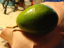
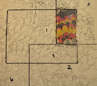
Color by Betty Edwards doing the individual lessons. I chose a fabric, divided my 10x10" board into six sections. Section #1 I glued the original fabric to the board. ( It was supposed to represent all of the major colors in the fabric).
The design in the fabric is way too detailed and it is driving me a bit crazy trying to match up the hue and color when I am directed to paint. It is transparent so it is next to impossible to determine value changes. Not fun!
 |
| STEP 1 |
 |
| STEP 2 & 3 |
Step 2, lower right, I was to paint matching color and value. Step 3 paint the compliment of the original colors. This step would have been easy if I had not picked a mind boggling design.
 |
| Step 4 |
Step 4, paint the opposite value but the same hue of the colors.(upper right)
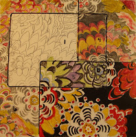 |
| Step 5 |
Now I am starting to take liberties with the colors within the design; I just want to finish this lesson. Step 5 added the compliment of the original color to point out how a neutral is important to a final painting.
 |
Step 6
Step 6 goes back to duplicating the original color and values.
In all honesty I did not do justice to this lesson. I truly see the value in this exercise and I will repeat the lesson with a simple design.
Much to be learned. |