If only I had an I Pad or Photo Shop on my computer, I wouldn't have to resort to using what I have on hand to choose colors for my designs!
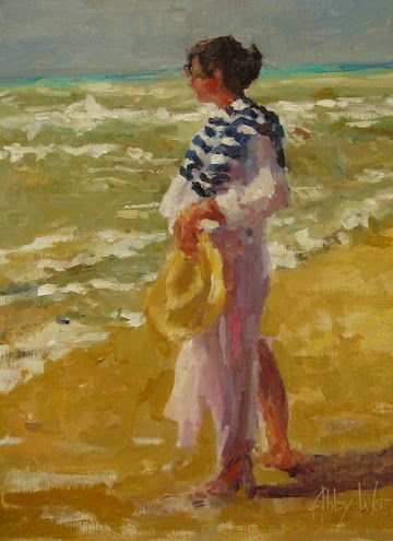
I just finished a painting where the background color drove me crazy. I have 4 layers on the background of the canvas and finally ended up with a blue that I muted with a touch of red. I even got out my handy invention of using left over scrap booking colored papers to try to determine the best color to use. Just hold them up to the painting to see which one looks best. Low tech at best.
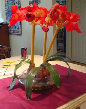
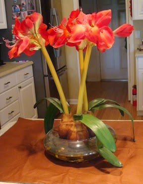
Today I used colored tissue papers to determine the best color to set a silk plant on so that it makes the best color design. I will also use the still life as a reference. Quick and Cheap.
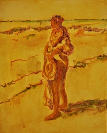
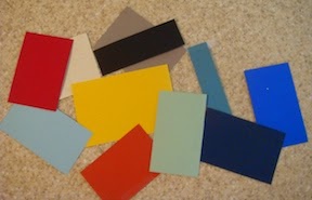
Which color would you choose for my next painting?
 |
| Dark Blue |
 |
| Deep Red |
 |
| Warm Brown |
 |
| Medium Blue |
 |
| Purple |
Decision made; a cool color and I think the Medium Blue makes the subject sparkle over the other color choices. I guess this could work for background colors if you tape the tissue paper up behind the plant.
 |
| Red Background |
 |
| Yellow Background |
 |
| Orange Background |
 |
| Monochromatic Background |
 |
| Purple Background |
 |
| Light Blue |
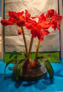 |
| White Background |
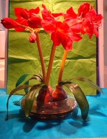 |
Green Background
Which background would you choose? |
 |
| Pink |
In the end the amount of time I took doing this mattered but not a lot. Could anyone recommend an I Pad that could purchase that would do all of this? I need one that has functions for an artist.
Thanks.