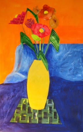
Sunday, July 27, 2014

HELP ME NAME MY NEWEST ABSTRACT PAINTING

START

                                          OK, enough with the lessons, I just want to paint.

     Above is the underpainting I did to start my 38 x 38" canvas which I let dry and then painted more yellow/green & blue over it using the limited palette  that I have been talking about in my previous blogs. I find myself referring to the chart I did using Laurie Snow-Hein's workshop information.
Maybe I learned a little more than I thought doing these exercises.

FINISH


    My tools were a palette knife and a credit card to create the focal point colors. I have no rationale for why I did anything; I just painted. Using the limited palette did make all the colors that I used harmonize with each other so I was not worried about making mud.

     Please help me name this newest painting. Thanks.

Sunday, July 20, 2014

USING TRANSPARENT VS. OPAQUE COLORS IN A PAINTING

   
Testing Chart
     I never knew when to use transparent or opaque colors in a painting. From reading it seems they are another method to be utilized just as warm vs colors, contrast, focal paint or soft vs hard edges. My goal with this writing is to teach myself how to use yet another tool to enhance my art work. 
     First I need to determine the transparent or opaque qualities of the colors that I have chosen for my limited palette: (see previous blog)
     *warm; Cad. Red Light      & cool; Alizarin Crimson
     *warm; Cobalt Blue           & cool; Ultra Marine Blue
     *warm; Cad. Yellow Med. & cool; Cad. Lemon
(I am adding Thalo Blue & Thalo Green for the beautiful blending colors they create plus Dioxazine Purple and Raw Sienna to reproduce the color palette of Laurie Snow-Hein)

TRANSPARENT                                                OPAQUE
Cobalt Blue ( semi)                                            Cad. Red Light
Alizarin Crimson                                                Cad. Yellow Med.
Thalo Green                                                        Raw Sienna
Thalo Blue                                                           Cad. Lemon
Dioxazine Purple (semi)                                     White      
Ultramarine Blue (semi)

HOW TO USE TRANSPARENT VS OPAQUE IN A PAINTING:
    "There are many ways to apply paint to create visual excitement. One way is a transparent-opaque approach. This type of application is not new. Rembrandt worked with thin transparent and translucent areas against opaque applications to create form".   Color Choices by Steven Quiller.

I  put down a Dioxazine Purple (transparent) as an underpainting, let it dry then added opaque Cad. Red and Cad. Yellow in a horizontal line.  After watching several You Tube videos I went back and added a diluted purple line, an out of the tube purple line and lastly purple mixed with white(opaque).

RESULTS: I learned:
* All paints can be transparent if enough water is added enough.
* Adding white makes any color opaque.
* Glazing with transparent colors gives a sparkle to the painting.
* Use transparent paints as the foundation of the painting.
**Transparent colors recede and opaque advance an object which adds depth to a painting.
                             **This little bit of information is the secret!!
Transparent  Dioxazine Purple base              
Opaque Cad. Red & Cad. Yellow

lin
Addition of 3 transparent purple lines.


Wednesday, July 16, 2014

LIMITED PALETTE COLOR BLENDING


Northern Lights- Private Collection in Alaska

Left to my own devices I blended colors to create Northern Lights.  It was painted many years ago so one would think that my plethora of workshops and reading would greatly improve my art work.
My most recent workshop was with instructor Laurie Snow Hein. She demonstrated some color mixing magic during her  presentation for her students. With palette knife in hand, she made it look so easy but I have been afraid to tackle the daunting task of reproducing her demonstration. I know that I have learned far more as a teacher than I ever did as a student plus I am an audio visual learner so this is my way of "learning" the blending concepts.
I'm going in.

     Here is the list of colors on her limited palette that Laurie uses to create all of the color variations for her art work: Cad. Yellow or Lemon Yellow, Cad. Orange,Cad. Yellow Med., Cad. Red, Alizarin Red, Thalo Blue, Thalo Green, Utla. Marine Blue, White,  Burnt Sienna & Dioxazine Purple .

    I will be mixing the above colors on a large disposable paper palette using a palette knife, take a photo to prove I did my homework and then give you a summary of what I learned. It is the only way I will absorb what Laurie was trying to teach me.

   
Colors 1-4

Colors 5-8 and Warm Black

Colors 9-10 and Cool Black
     My colors did not quite match hers but I did get a wonderful flesh tone and learned how to make black using the colors on a limited palette. I got over my fear of Thalo Green and Thalo Blue finding them delightful when mixed with other colors. My grays did not come out as well as Laurie's and I simplified the chart when I could not understand some of the extra blends she had on her handout. Wish I had more gained knowledge or insight to report from this time consuming exercise but I don't.

     I am not noted for my patience to do prior preparation for a painting or doing the work to learn how to blend paints so this may have been an exercise in just: "do the homework"!


Saturday, July 5, 2014

I'M A COLORIST.


Paste Paper Flowers

     Why is it that, as I graciously age, I like chocolate and bight bold colors more and more?

     As I read and research I am better understanding this warm/ cool color theory thing. I understand that there are warm and cool colors but I was unaware of the warm and coolness within a single color and how combining them affected my art work. Using a limited palette kept coming up in my reading so I am trying it. In the past I had a bucket full of colors and used them as the mood struck me and many times I ended up with a lack luster painting. How did other artists get their vibrant colors? From my reading is seems my biggest problem was mixing a warm color  with a cool complimentary color to tone it down or create a  new color. Results:dull muddy colors. If I had mixed my warm color with a warm compliment color it would have worked! So the theory goes.

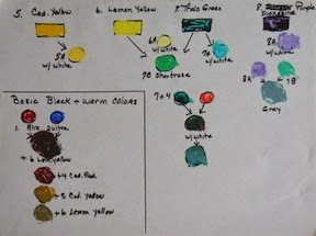
     Because I am trying a limited palette, I will only take one warm & one cool red, a warm & cool blue and a warm & cool yellow with me to my open studio painting sessions. This forces me to paint with a limited palette. I also take white and an umber. I do underpainting on the canvas to help the colors vibrate as they peek through.

Here are the color I will be forcing myself to use:
*warm; Cad. Red Light      & cool; Alizarin Crimson
*warm; Cobalt Blue           & cool; Ultra Marine Blue
*warm; Cad. Yellow Med. & cool; Cad. Lemon

There are other colors that can be substituted but for now I only know these colors.

     I have to admit that I get frustrated on some paintings and fall back into my comfortable bad painting habits. At some point my paint brush will catches up to my brain's new knowledge and my art work should improve greatly.

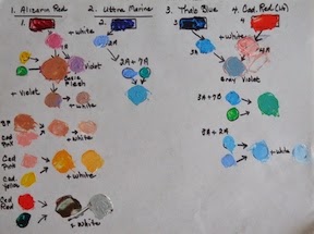
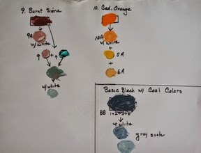
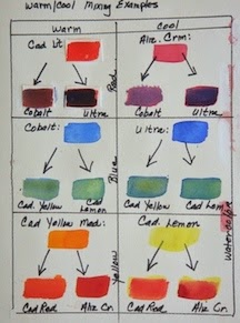
The retired science teacher in me had to give you a visual but in the process the warm/cool color theory did not hold up! First I made a warm/ cool chart using acrylics.
ACRYLIC CHART
I could not see the dull color when I mixed the warm with the cool compliment. The only color that looked dull was mixing ultra marine blue with cadmium yellow.

Next I will try a chart using watercolors; maybe that will adhere to the color theory better. I do realize that I made no attempt to determine equal amount of paint that were mixed together; I just slapped it down to see what happens. I see a difference in the colors produced but I don't find them to be muddy whether I mix warm to warm or warm to cool colors.

Nice try Eclectic Artist!

Please advise me; what is the problem?
   
WATERCOLOR CHART