Saturday, October 25, 2014

SHOTGUN ART

Realism Watercolor
     Call it ADD or extreme curiosity but I am fascinated by so many things in this world. I have had my Oriental phase, Abstract phase, Figurative, Whimsy or whatever sparkles in front of my eyes at the moment.
This was the main reason I call myself an "Eclectic Artist".

Abstract Mixed Media
Acrylic Whimsy
                                                       
     All advice given to me is to perfect one genre so that I can brand my art work and people will easily recognize a Koser Original. I am aware of this marketing technique but I don't paint for sales, I paint for me and my goal is to be an exceptional artist. I have a long way to go but I am actively engaged in the journey.


 http://www.verobeachartclub.org/gallery.php   koserme@gmail.com     Google+

Wednesday, October 22, 2014

HOMEWORK COMPLETED

BLOG ENTRIES UNFINISHED:

I TOOK AN ARTISTIC WALK ABOUT
 & CHINESE JOURNEY SERIES-PANDA SANCTUARY.


COUSINS
     If you follow my blog at all you know that I had not completed the Red Bench and the two children paintings. Part of the problem was that my
 I Photo had frozen and I could not upload pictures of my art work.  I tried everything I could think of then  called for tech support and magically it was fixed. This was painted in low light and I won't know the results until it is hung on someone's wall or in a gallery so no lesson learned here.


    I also finished the China-Red Bench that I started a blog or two ago. I was using neutrals to enhance the bright red of the bench. When I left it was in that; "ugly painting" stage and I honestly thought I would chuck it out. Using pen and ink I added detail and punched up the contrast with blue plus I tried to use negative space painting to give the illusion of bamboo. Put a mat around it and it isn't half bad. 
RED BENCH
LESSON LEARNED:
Wait a day or a week before giving up on a painting.

Sunday, October 12, 2014

I TOOK AN ARTISTIC WALK ABOUT: Painting in low light

I know my assignment was to finish or redo the Red Bench painting. The neutrals that I used really did not work for me and I will finish it in due time.

A friend asked me to do a painting of her grandkids which called me away from my task at hand. I have decided to take a journey down the human figure path as I also practice my newly learned lessons.

 The lesson I am combining with this project  is painting in a low light.
 I have noticed that some of my work looks great under my studio light  and then at an art show location not so much. Art shows and some galleries have notoriously poor lighting for exhibit paintings properly.

Would I be further ahead to paint in less than perfect light in order to compensate? I am trying to paint in just day light without the aid of full spectrum artificial lighting.

#1
This painting started with a monochromatic palette in mind but somehow it morphed into a little bit of color. Be still my wondering paint brush.

The color does seem to be more intense so maybe the low light thing works. I will try a few other paintings to see if the same holds true.

Final Painting
The last photo is my finished product with one eye a bit askew. I will work on that before giving it to my friend.
 Somehow my I Photo importing has frozen up so I could not edit my final product. Forgive me but I must dive into the bowels of the Mac to try and figure this out.

I enjoyed the process.


Please follow me on:
 http://www.verobeachartclub.org/gallery.php           Google+

Sunday, October 5, 2014

CHINA JOURNEY SERIES- PANDA SANCTUARY


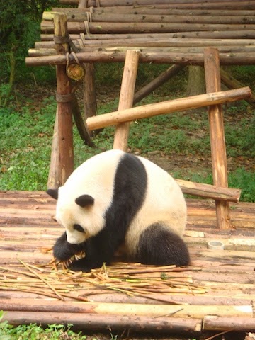
Part of our China journey took us to the Panda Sanctuary located just outside of Chengdu. We were told that this is the largest population of live pandas on display in the world. The 3 panda clubs were the most adorable fuzzy things ever.


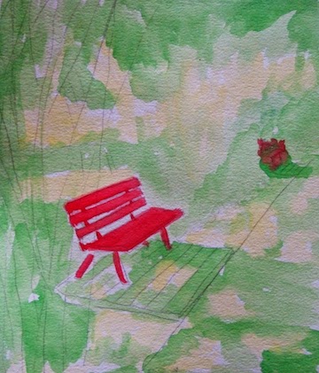
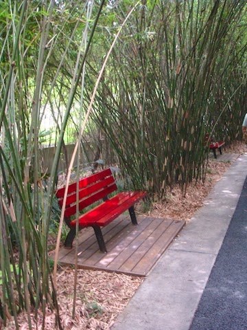
My goal with the photos that I took was to capture scenes that I thought might be good material for watercolor or acrylic paintings. One of the photos was of a bright red bench surrounded by wispy bamboo shoots. If I take photos of scenes that are design balanced in the raw state I have solved half of the problems of painting good art work.
My photo

I am planning on doing the Red Bench in watercolor and try to combine it with a lesson on using neutral colors to emphasize the brighter hues around them.

RESEARCH:
I recently read an article by Steven Quiller in Artist Magazine where he gives instruction on how to mix the proper neutral that will harmonize with a specific painting.

His basically states that..."Using semi-neutral and neutral colors with some carefully selected brighter colors brings the painting to life". Quiller achieves these neutral by mixing the colors of the palette used in the painting with their direct compliment or  a pair of colors to either side of the direct compliment to get the proper neutral.

MY ATTEMPT:
Obviously bright red is the bold color so now I have to mix harmonizing neutrals to use in the bamboo surrounding the bench.
Sketch and first color

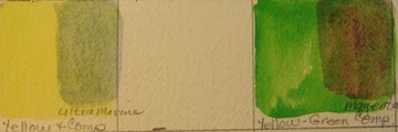
My limited palette will be yellow, yellow-green and red. Using a Quiller  color wheel I chose my compliments to create neutrals from the original palette. Yellow uses ultra marine blue and yellow-green uses magenta.

Applying compliment


 I used the glaze technique to apply the complimentary color (magenta) to the green. I will leave the yellow as pure color to show peeks of sunshine through the bamboo. Some more testing is needed with other compliments to the yellow green to give more depth to the painting.
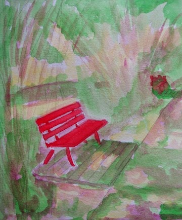
RESULTS:                                            
Well...., I will work on this some more and show you the results next week. Maybe mixing the paints before on the palette would give a more pleasing result.

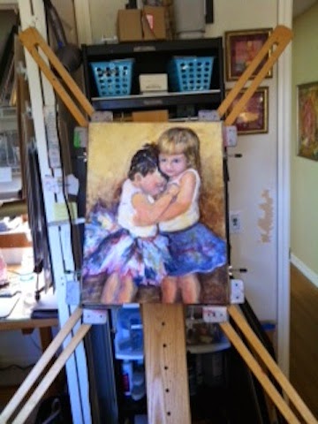
Please check out more of my art work on my web site:
http://www.verobeachartclub.org/gallery.php   koserme@gmail.com   Google+