Wednesday, December 23, 2015

MORE OF THE COLOR PROJECT

A few posts back I startED on a Donna Zagotta Color Project:
Monochromatic, Analogous, Complementary, Near complementary, Split complementary, Double Complementary, Triadic and Tetrad.
This exercise should improve my use and understanding of color intended to produce a specific mood.

Let's finish this project.
MONOCHROMATIC:(

ANALOGUS:)
COMPLEMENTARY:)

NEAR COMPLEMENTARY:(

DOUBLE COMPLEMENTARY:(
SPLIT COMPLEMENTARY:(

 TRIADIC :(
 I give myself points for finishing this assignment.  Most of the paintings will be do overs but the point was to try each of the color combinations.

TETRAD ?

Saturday, December 12, 2015

I SEE THE LIGHT; AND DARK AND COLOR!

 Photo
      After all the time I have spent reading, taking classes and experimenting I think I am beginning to isolate my problem areas in my painting technique.
     The passion and dedication has always been there and so has the willingness to learn but I think I can summarize three areas of needing insight:  
      * being able to identify the % of light/dark in colors
      * must do a sketch for design and value prior to each painting
      * use single stroke application of paint

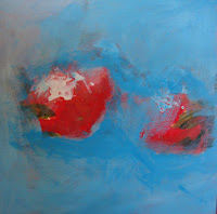
      It seems when I hit the canvas or paper I do the same thing as I have always done..dah and I get the same results, a master in mid-tone values. This time I will make myself do a drawing of the values and design of my subject, I pulled out my value chart that I have had for years and will make myself mix colors of different % value before I begin painting. Somehow I will force myself to do single or few stroke painting. A vortex of many strokes takes over my paint brush thinking that if I painting over it one more time it will be just right.  
    What a monster:(
Value Chart

Value Sketch

Do Over


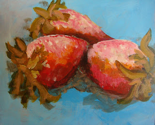
I still had trouble with the few stroke painting but I did improve and I stopped before I normally would. 


Sunday, December 6, 2015

ZAGOTTA LESSON CONTINUED

Another attempt at a monochromatic painting.

Paint over the first attempt.
First attempt: yuck!


Step one                
                 OK, I cheated. I really had a  hard time using just one color, it was boring so I took the liberty of using only cad. red but used white, blue and yellow to jazz up the cad. red.


Next I tried to soften the edge on the back strawberry and added oil pastel over the acrylic for a punch.

Used warm/cool temperature changes to the white background and added a gradation to the shadow area.

Final Product:

 I thought the shadow was a bit intense so I softened it but I prefer step one which tells me that I should stop way before I feel it is done.
Lesson learned~!


PS. I used a free photo from Morguefile.com so I could concentrate on the lesson and not finding a subject to paint.