Monday, November 30, 2015
Saturday, November 28, 2015
A LESSON FROM DONNA ZAGOTTA
Like any other full blooded artist I subscribe to numerous art magazines. Any magazine that particularly appeals to me I save and the others I share with my open studio painting mates. On those rare times when I run out of something to read I pull out the stored "sacred issues" and re-read the articles.
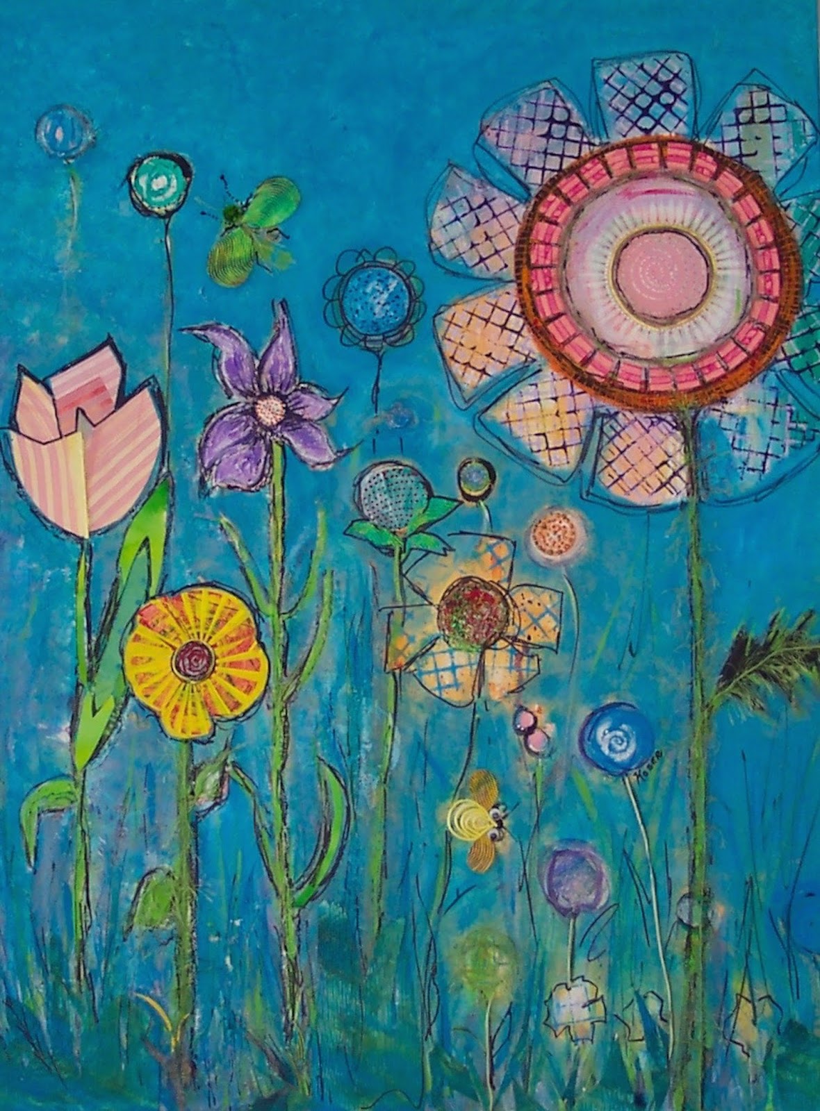
Watercolor Artist (April 2014) I underlined and highlighted so much from Donna Zagotta's article; THE COLOR PROJECT, that I decided to try some of her lessons.
I love color and loose paintings so now I am planning on trying the color schemes that she suggests;
Monochromatic, Analogous, Complementary, Near complementary, Split complementary, Double Complementary, Triadic and Tetrad. This should improve my use and understanding of color intended to give a specific mood or feeling and it sounded like fun.
Watercolor Artist (April 2014) I underlined and highlighted so much from Donna Zagotta's article; THE COLOR PROJECT, that I decided to try some of her lessons.
I love color and loose paintings so now I am planning on trying the color schemes that she suggests;
 | ||
Red Boat Photo
|

 |
| 6X6 board sketch |
 |
| Analogus Painting. I found it difficult to stick to the restricted analogous colors but maybe that is a good lesson to learn. Next I tried the monochromatic and my first attempt was miserable so I will repeat the lesson to show you later. |
Sunday, November 22, 2015
TEA PLEASE!
 |
| 1 |
 |
| 2 |
 |
| 3 |
Slowly my loose style is coming out and that pleases me but still a long way to go.
Sunday, November 15, 2015
PHOTOGRAPHING MY ART WORK
 |
| BEFORE with glass glare. |
 |
| AFTER with my invention. |
I learn everything the hard way with many hours used up by the learning curve. That is why I dearly love U Tube; have question will find answer!
I take all of my own photos, some are good and some not so much but I do realize the importance of quality photography when you are posting them on a blog site, web site or Daily Paint Works.
Some of my earlier works were professionally framed before I realize it was prudent to get photos prior to framing. I choose my frames to enhance my art work and not for a generic frame that the public will like. A good example is Toy Soldier (colored inks). Not all clients would love a deep purple frame with a notched mat but I love it.
All of my framed paintings under glass had a reflection of something in the photo. (see before example) I know enough not to use a flash.
To solve this problem I went to U Tube to find a simple answer that did not cost too much, here is what I invented from things I have around the house:
* I photograph out on the covered porch to get indirect natural light. I learned that from Carol Marine's section on photographing art work in her book Daily Painting.
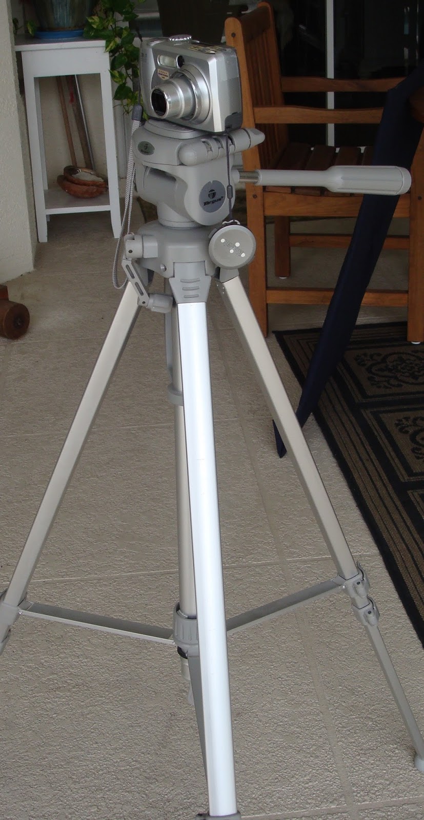 * I happen to have an older camera and tripod that I set up parallel to my adjustable wooden easel. It was easier and more stable to place the easel on a table and do the adjustments with the tripod and camera.
 * Next I needed a reflection blocker so I made it out of heavy cardboard which I covered with a dark fabric from my fabric stash. Cut a hole in the center and off we go. At the moment I have not found something to hold the reflector as I push the button so I just hold it with my left hand.

*I did make a second blocker from card stock which fits over the camera lens as it telescopes out to take the picture.

*Put the camera setting on close up, adjust the height of lens to the art work and take numerous shots.
*Upload onto the computer and edit as much as I can with just the I Mac tools.
I'm so proud of me:)
Friday, November 6, 2015
TEA BAG SERIES
Keeping it simple focusing on values.
 |
| Tea bag photo |
 |
| First sketch I'm trying so hard to get my semi abstract style to come to fruition. What is your opinion? Did I hit the mark? |
 |
| TEA BAGS FOR TWO |
Subscribe to:
Comments (Atom)