Friday, September 25, 2015

DON'T KNOW


What is the meaning of life, is there life on other planets, is there a heaven or a hell?
For me all the deep questions in life are summed up in these simple oriental symbols.
 I truly don't know.

Thursday, September 17, 2015

Painting Update

     I may have paused blogging but I have been painting. Here is my most recent that I finished for Daily Paint Works where you can keep up with my progress.

TEA POT FOR ONE

May the colors fly off of your palette onto the canvas with ease:)
Mary Ellen

Sunday, August 16, 2015

BLOG PAUSE


Painting a fire hydrant in our dog park.

   As I grow older I try to listen more and talk less, so taking my own advice  I think it is time to paint more and write/blog less.

The value of my art blog was to keep me focused and learning but the time has come to pause and prioritize my time usage.

I bid you well on your artistic ventures.

Mary Ellen
ANTIQUITY WARRIOR POET Mixed Media

Saturday, August 8, 2015

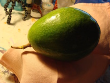
AVACADO SEASON

     It is August and our avacado tree is full of ripening green teardrop orbs. I take them to share with my painting group and Silver Sneakers exercise class. So why not paint the bounty of home grown.

    I pre-painted the canvas with acrylic paints to create the design and then finished it with oils using a palette knife to up the texture factor.

     This time I made myself create a mother pile of color with  warm and cool sub color piles. The value of the warm/cool paint went from dark to light to capture harmonious values.

I used a different photo that captured some foreshortening of the stem.


I like this one better than my finished product. When will I learn to stop painting?

Oil over lay.

Sunday, August 2, 2015

COLOR CONUNDRUM CONTINUED


     Let me refresh your memory; I am reading Color by Betty Edwards doing the individual lessons. I chose a fabric, divided my 10x10" board into six sections. Section #1 I glued the original fabric to the board. ( It was supposed to represent all of the major colors in the fabric).
The design in the fabric is way too detailed and it is driving me a bit crazy trying to match up the hue and color when I am directed to paint. It is transparent so it is next to impossible to determine value changes.  Not fun!


STEP 1
STEP 2 & 3
Step 2, lower right, I was to paint matching color and value. Step 3 paint the compliment of the original colors. This step would have been easy if I had not picked a mind boggling design.

Step 4
 Step 4, paint the opposite value but the same hue of the colors.(upper right)
Step 5

     Now I am starting to take liberties with the colors within the design; I just want to finish this lesson. Step 5 added the compliment of the original color to point out how a neutral is important to a final painting.
Step 6

Step 6 goes back to duplicating the original color and values.
In all honesty I did not do justice to this lesson.  I truly see the value in this exercise and I will repeat the lesson with a simple design.
Much to be learned.


Sunday, July 26, 2015

THE COLOR CONUMDRUM

My instructor felt my weak area was color so I bought Betty Edward's book on Color which I am reading and doing the lessons page by page.

I made the color wheel, value wheel, color surrounded by a neutral and now I am working on color harmony.

Taking a piece of illustration board I taped off the edges, found a designed fabric that I liked, photo copied the fabric and traced the black and white design onto the board.
Fabric

B/W photo copy

Traced design.
Next I must divide my 10x10" into 6 sections. Because the design of the fabric is so busy I will choose a simple box within a box design. The geometric shapes are a rectangle so as not to repeat the square design and the boxes were placed off center.

I chose a geometric shapes for my divisions to act as a foil to the organic shapes of the fabric design.
First division 

Second division

Adding fabric sample
Now I have to color in area 2 with all of the colors of the fabric sample matching value and hue. This make take awhile seeing that I chose an intricate design.

I shot myself in the foot with this one.

To be continued.

Saturday, July 18, 2015

STUDIO PINK

PINK
Three years ago my husband and I adopted our 7th rescue dog. I would like to introduce my art therapy dog & my studio helper; Pink. No, we did not name her but it fits her with the inside of her ears and her belly as pink as can be.

Music on, canvas primed and a painting we will go.

I am trying to develop my own style and at the same time learn from other artists such as Lisa Daria and Carol Marine. I watch the U Tube videos, read their books and practice their style but where is my style? Next I will read Betty Wade's Color Theory and then put the books and classes aside and just paint.

This is the part where I give myself a pep talk and say; one painting at a time, be confident that the answers will come and maybe relax.                

 Pink, what do you think?
"You talking to me?"


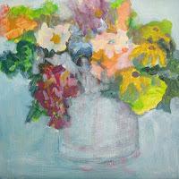
BOUQUET 1
I am analyzing what needs to happen to complete this daily painting. I like the negative painting on the flower the best, the vase needs to be grounded so it does not float on the canvas, the background is too similar to the vase color in hue and value, etc.

That will give me something to work on. I do find the camera to be a useful tool to see my mistakes.

BOUQUET 2
Did you notice how I changed the background and totally lost my flower focal point. I still need to ground the vase and on top of that improve the flowers. I hate it.

 Don't waste paint just slap it all onto the canvas to cover up what displeases you.

FRUSTRATION
Me thinks I am not a floral painter!