Sunday, October 5, 2014

CHINA JOURNEY SERIES- PANDA SANCTUARY


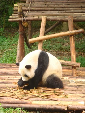
Part of our China journey took us to the Panda Sanctuary located just outside of Chengdu. We were told that this is the largest population of live pandas on display in the world. The 3 panda clubs were the most adorable fuzzy things ever.


My goal with the photos that I took was to capture scenes that I thought might be good material for watercolor or acrylic paintings. One of the photos was of a bright red bench surrounded by wispy bamboo shoots. If I take photos of scenes that are design balanced in the raw state I have solved half of the problems of painting good art work.
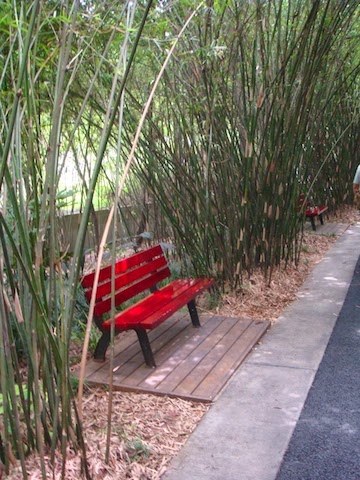
My photo

I am planning on doing the Red Bench in watercolor and try to combine it with a lesson on using neutral colors to emphasize the brighter hues around them.

RESEARCH:
I recently read an article by Steven Quiller in Artist Magazine where he gives instruction on how to mix the proper neutral that will harmonize with a specific painting.

His basically states that..."Using semi-neutral and neutral colors with some carefully selected brighter colors brings the painting to life". Quiller achieves these neutral by mixing the colors of the palette used in the painting with their direct compliment or  a pair of colors to either side of the direct compliment to get the proper neutral.

MY ATTEMPT:
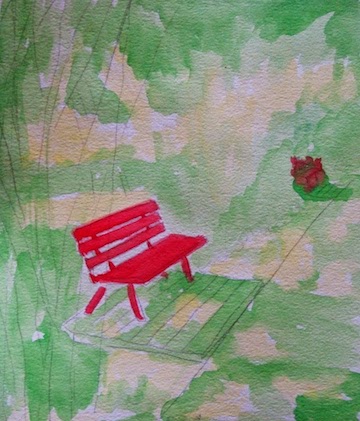
Obviously bright red is the bold color so now I have to mix harmonizing neutrals to use in the bamboo surrounding the bench.
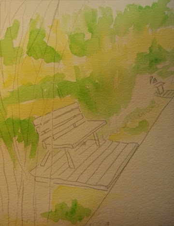
Sketch and first color

My limited palette will be yellow, yellow-green and red. Using a Quiller  color wheel I chose my compliments to create neutrals from the original palette. Yellow uses ultra marine blue and yellow-green uses magenta.
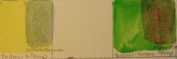
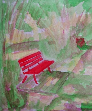
Applying compliment


 I used the glaze technique to apply the complimentary color (magenta) to the green. I will leave the yellow as pure color to show peeks of sunshine through the bamboo. Some more testing is needed with other compliments to the yellow green to give more depth to the painting.
RESULTS:                                            
Well...., I will work on this some more and show you the results next week. Maybe mixing the paints before on the palette would give a more pleasing result.

Please check out more of my art work on my web site:
http://www.verobeachartclub.org/gallery.php   koserme@gmail.com   Google+

Thursday, September 25, 2014

I WENT TO CHINA. DID YOU MISS ME?

My husband and I  took a bucket trip to China / Tibet for three weeks. We traveled with Overseas Adventure Travel which did a fabulous job but I have some serious jet lag right now. I know for sure that if I cannot fly first class on any future transcontinental flights, I will never travel again.

The trip was more arduous than I expected but I managed to traverse  Tiananmen Square &  Forbidden City, walked up the 250 of the 800 steps of the Great Wall with arrival jet lag (I have the walking stick to prove it; made in China).  Survived the high pitch of the Beijing Opera using a little secret; I wore ear plugs:)


 I saw the Terra Cotta Army and stayed overnight with a Chinese family in Hu Xian Donghan Village.
 Intrigued by languages I used my Che Che( "thank you"), Ne Hou ("hello") and Wo bu hou ( "I do not want") all over China. Oh the noodles and rice with sweet and sour pork. Did try a taste of the  yak butter tea and ate yak meat but yearned for a cheeseburger.

I walked my way up to the Panda Sanctuary which had three adorable baby pandas on display.
There were four internal flights on the trip plus the government did permit the tour to go to Tibet. In Lhasa I climbed  another 325 steps up to the Potala Palace in the rarefied air of 12,000 feet above sea level.  Each adventure I get slower and slower climbing the stairs. All the temples use very heavy incense so I ended up wearing a nose/mouth mask as we toured.
 

Next spent 3 days on a Yangtze River cruise ship.  Visited a family displaced by the Three Gorges Dam, went to see  the Gorges and one hanging coffin in the steep cliff.
Took a Hong Kong City tour which was beautiful at night. We shopped much less than the other seasoned travelers but did get gifts for the kids and grand kids.


Coming home I traveled through three airports, crossed over a date line and changed several  times zones but over 24 hours later I arrived home.  
There's no place like home!!

Sunday, August 31, 2014

COLOR CHANGE INSTEAD OF VALUE CHANGE CONTINUED.

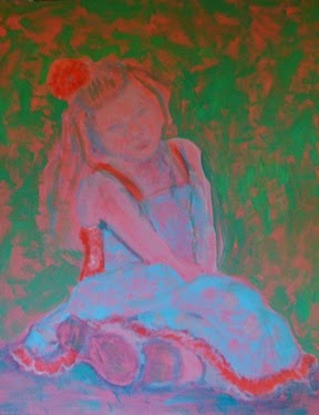
Here is my painting of a child update.
     I am going to critique my own work and would hope that others will add their constructive opinions.


* the shoes are too dark and pull away from the over all focus point of the face
* the blonde hair should have more color variation ( pull in some of the background color)
* the facial features are too stiff (use more soft edges)
*the dress needs to be more intense to hold its own with the rest of the painting
* the hair flowers need a dark edge at the bottom so they feel grounded

Your Turn:
*
*
* Thanks

www.verobeachartclub.org      Artist Gallery
koserme@gmail.com
Google +

Sunday, August 24, 2014

COLOR CHANGES INSTEAD OF VALUE CHANGES

     Watermedia Focus Workbook, Christopher Schink;... " employing color and intensity changes rather than using strong value changes. To keep the interior of shapes interesting I've alternated areas of warm and cool hues and bright vs neutral intensities".

Pink Under Painting
Today I want to paint a child in a free painterly style using the warm cool shift instead of the value shift. The color choices are more symbolic that realistic, in other words it will not look like my granddaughter in the photograph.  My focus will be to use warm and cool color to get my message across.

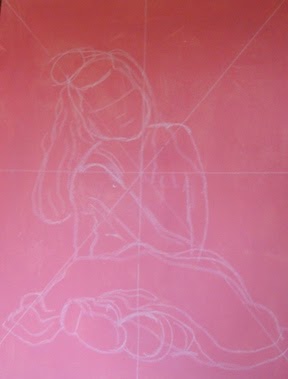
Enlarging the image
For the second step I used white chalk and a diagonal grid to draw a larger version of the photo.


Next I blocked in the cool colors and I am still using the Lori Snow-Hein limited color palette.

It is slowing taking form but I feel I am losing my original color focus. The background color still bothers me but I can't decide what cool receding color to use.


 I'm lost but will not give up.
I have no clue when using color instead of value flew out the window and I just kept on painting! The painting of my granddaughter has morphed into a more realist style than I had in my mind when I  started out. This will not be a finished product by my self imposed Sunday publishing date but I'd rather take my time and be pleased with the results.
To be completed at a later date:)
Please check out my web site at: www.verobeachartclub.org

Sunday, August 17, 2014

HOLY MAXIMUM CHROMA

     Maximum Chroma is the highest amount of pigment that a color can have; which is straight out of the tube. I keep trying for a high key pastel painting and every time I get highjacked into something else.

Stage One.
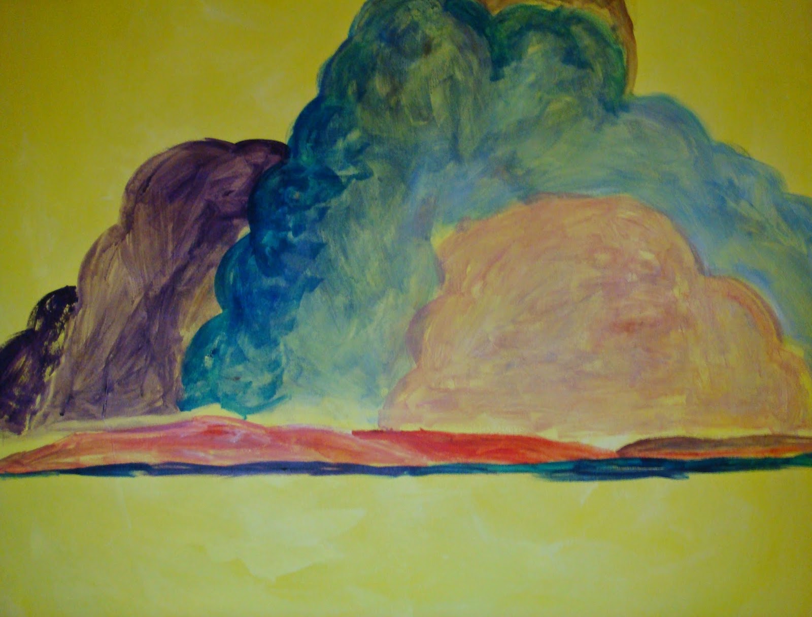
This started out as a total yellow canvas and I was planning on going pastel with clouds and sea. Actually it took me a week to decide on the subject.


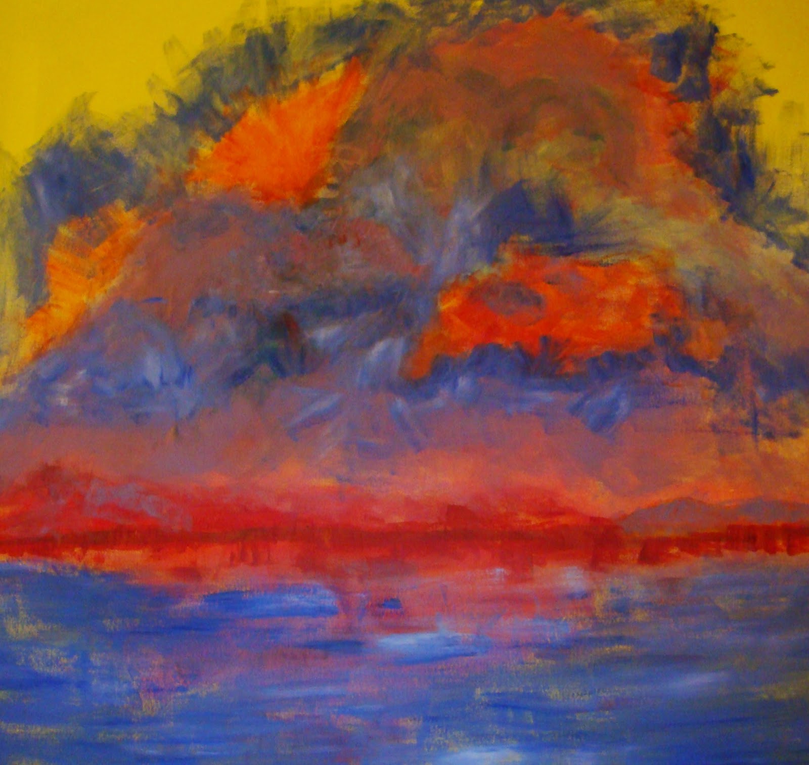
The next thing I knew it has morphed into a jewel toned, in your face painting. My usual MO is to go on to overwork a picture so I need to learn when to stop.


Stage Two
Stage Three

It is growing more pastel and high key but the clouds are too much in one clump and there are too many shapes and colors competing with each other. To unify the sky I made up a light blue glaze and painted over the entire sky area. That should make it read as one unit instead of many small units.

The red band was intensified and a spot of complimentary green was added to make the red focal point pop out more.


Final Painting: The last critique is in your hands.

SKY HIGH


Saturday, August 9, 2014

Try, Try and Try Again

     As stated in my last post, I was going to practice painting glowing, luminous paintings.
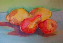
Here was my first attempt. Please note it was on used watercolor paper so the paper was compromised, I made no attempt to try and make a finished work of art; just practice.
It looks better in the photo than real life.

* Used a transparent, complimentary cool color for the wall
* Used a cool transparent color for the table
* Placed a dark purple at the base of the fruit to ground them
* Use white crayon to block out the white of the paper ( did not work well and I did not have a liquid frisket on hand)
* Used transparent colors on the fruit, let it dry then layered over with more transparent colors.

RESULTS: Just OK


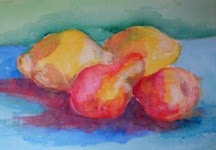
This time I exaggerated the colors and added white just to see if it helps the luminosity.
I'm not impressed.
I will try again.
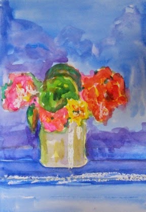
With a different subject I painted a cool transparent background using only two colors and desperately trying to utilize one stroke painting.
The Windmill Easel is great for directing the flow of the juicy watercolor paints; it turns 360 degrees.
I need to give it a rest!


Please view my web site at:       http://www.verobeachartclub.org/gallery.php

Sunday, August 3, 2014

LUMINOUS, GLOWING, SATURATED COLOR PAINTINGS


     After watching You Tube videos, scanning Handprint.com, reading art magazine articles and searching my art book collection I have gained some knowledge about glowing/luminous/saturated color paintings.

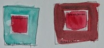
1. I did the test where you crisscross all the paints on your palette
    ( watercolor using the Steven Quiller palette)
Messy but homework done!

2. Use transparent watercolors
3. Glaze over dried paint with another transparent color
4. Keep the brush strokes to a minimum; like one stroke
5. Don't layer warm colors with cool colors
complementary / neutral surround
6. Colors seem more glowing next to a complementary color or a neutralized color
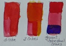
 7. Only combine a maximum of 2 colors; 3 gives mud
2 color/ 3colors & analogous colors

8. Paining with colors adjacent on the color wheel will remain clear and bright

   9.  I have chosen three transparent colors to do a test painting.
 Painting #1 uses: Magenta, Cerulean Blue & Cad. Orange (diluted down to be transparent)
               #2 Yellow Green, Red orange & Cobalt Blue
               #3 Indian Yellow, Yellow Green & Ultra Marine Blue


    RESULTS:   I did not achieve the "glow" that I see in other artist's paintings but I won't give up. I have observed that using any yellow/ orange color plus leaving some of the white paper adds to the glow illusion, that you can add 3 colors and not get mud and that I have a long way to go before I sleep on this lesson.

My next blog will be watercolor attempts at luminous, glowing, saturated color paintings!