Sunday, December 6, 2015

ZAGOTTA LESSON CONTINUED

Another attempt at a monochromatic painting.

Paint over the first attempt.
First attempt: yuck!


Step one                
                 OK, I cheated. I really had a  hard time using just one color, it was boring so I took the liberty of using only cad. red but used white, blue and yellow to jazz up the cad. red.


Next I tried to soften the edge on the back strawberry and added oil pastel over the acrylic for a punch.

Used warm/cool temperature changes to the white background and added a gradation to the shadow area.

Final Product:

 I thought the shadow was a bit intense so I softened it but I prefer step one which tells me that I should stop way before I feel it is done.
Lesson learned~!


PS. I used a free photo from Morguefile.com so I could concentrate on the lesson and not finding a subject to paint.


Monday, November 30, 2015

Saturday, November 28, 2015

A LESSON FROM DONNA ZAGOTTA

Like any other full blooded artist I subscribe to numerous art magazines. Any magazine that particularly appeals to me I save and the others I share with my open studio painting mates. On those rare times when I run out of something to read I pull out the stored "sacred issues" and re-read the articles.

Watercolor Artist (April 2014) I underlined and highlighted so much from Donna Zagotta's article; THE COLOR PROJECT, that  I decided to try some of her lessons.

I love color and loose paintings so now I am planning on trying the color schemes that she suggests;

Red Boat Photo


Analogus colors
Monochromatic, Analogous, Complementary, Near complementary, Split complementary, Double Complementary, Triadic and Tetrad. This should improve my use and understanding of color intended to give a specific mood or feeling and it sounded like fun.


6X6 board sketch
Analogus Painting.
I found it difficult to stick to the restricted analogous colors but maybe that is a good lesson to learn. Next I tried the monochromatic and my first attempt was miserable so I will repeat the lesson to show you later.


Sunday, November 22, 2015

TEA PLEASE!

1

2

3
Here are some snap shot stages of my Tea Please daily painting. This time I added a tea tin and went for the glow of back lighting.

Slowly my loose style is coming out and that pleases me but still a long way to go.


Sunday, November 15, 2015

PHOTOGRAPHING MY ART WORK

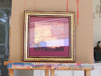
BEFORE with glass glare.


AFTER with my invention.
                                                                                                 TOY SOLDIER   

 I learn everything the hard way with many hours used up by the learning curve. That is why I dearly love U Tube; have question will find answer!

I take all of my own photos, some are good and some not so much but I do realize the importance of quality photography when you are posting them on a blog site, web site or Daily Paint Works.
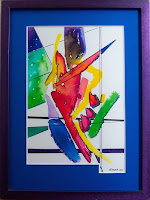
Some of my earlier works were professionally framed before I realize it was prudent to get photos prior to framing. I choose my frames to enhance my art work and not for a generic frame that the public will like. A good example is Toy Soldier (colored inks). Not all clients would love a deep purple frame with a notched mat but I love it.

All of my framed paintings under glass had a reflection of something in the photo. (see before example) I know enough not to use a flash.

To solve this problem I went to U Tube to find a simple answer that did not cost too much, here is what I invented from things I have around the house:

* I photograph out on the covered porch to get indirect natural light. I learned that from Carol Marine's  section on photographing art work in her book Daily Painting.
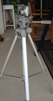
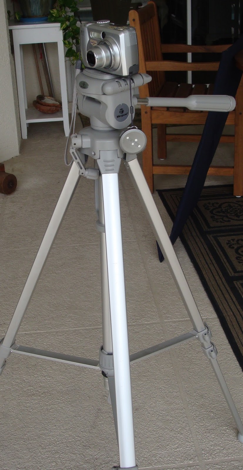
* I happen to have an older camera and tripod that I set up parallel to my adjustable wooden easel. It was easier and more stable to place the easel on a table and do the adjustments with the tripod and camera.


* Next I needed a reflection blocker so I made it out of heavy cardboard which I covered with a dark fabric from my fabric stash. Cut a hole in the center and off we go.  At the moment I have not found something to hold the reflector as I push the button so I just hold it with my left hand.
 
*I did make a second blocker from card stock which fits over the camera lens as it telescopes out to take the picture.   


*Put the camera setting on close up, adjust the height of lens to the art work and take numerous shots.
*Upload onto the computer and edit as much as I can with just the I Mac tools.

I'm so proud of me:)

Friday, November 6, 2015

TEA BAG SERIES

Keeping it simple focusing on values.
Tea bag photo


First sketch

I'm trying so hard to get my semi abstract style to come to fruition.
What is your opinion? Did I hit the mark?


TEA BAGS FOR TWO


Monday, October 26, 2015

VERO BEACH ART CLUB COMMUNITY SERVICE

Almost done.

Hibiscus Children's Center does such good work to help children in need within our community. They have organized  an auction of original art embellished chairs for a fundraiser titled: "CHAIRISH THE CHILDREN".

     How do I get into these things...well it was a good cause, I showed up for the meeting and I said yes to volunteering to help. Next thing I know I said yes to painting the bench in my garage, yes to being the point of contact person and yes to feeling totally responsible for the out come of the bench painting project.  I got my weekly open studio ladies to say yes to helping me which means I got us all into this project.
      Great, more Mid-West guilt on my shoulders.

It takes a village.


My flower.
Because it was in my garage I traced the pattern onto the bench, outlined the design and painting one arm of the bench.  After everyone was done I outlined everything with black.
Oh my aching back and the hours that disappeared!
My science teacher came in handy as I organized the painting stations, etc.
I am so over this bench but now we feel the background of the bench should be painted. It looks unfinished.

I'm just tired but the cause is still a good one.