Wednesday, July 16, 2014

LIMITED PALETTE COLOR BLENDING


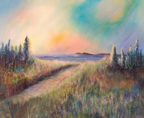
Northern Lights- Private Collection in Alaska

Left to my own devices I blended colors to create Northern Lights.  It was painted many years ago so one would think that my plethora of workshops and reading would greatly improve my art work.
My most recent workshop was with instructor Laurie Snow Hein. She demonstrated some color mixing magic during her  presentation for her students. With palette knife in hand, she made it look so easy but I have been afraid to tackle the daunting task of reproducing her demonstration. I know that I have learned far more as a teacher than I ever did as a student plus I am an audio visual learner so this is my way of "learning" the blending concepts.
I'm going in.

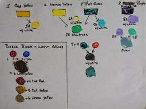
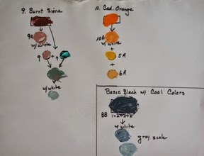
     Here is the list of colors on her limited palette that Laurie uses to create all of the color variations for her art work: Cad. Yellow or Lemon Yellow, Cad. Orange,Cad. Yellow Med., Cad. Red, Alizarin Red, Thalo Blue, Thalo Green, Utla. Marine Blue, White,  Burnt Sienna & Dioxazine Purple .

    I will be mixing the above colors on a large disposable paper palette using a palette knife, take a photo to prove I did my homework and then give you a summary of what I learned. It is the only way I will absorb what Laurie was trying to teach me.
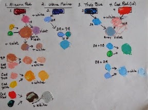
   
Colors 1-4

Colors 5-8 and Warm Black

Colors 9-10 and Cool Black
     My colors did not quite match hers but I did get a wonderful flesh tone and learned how to make black using the colors on a limited palette. I got over my fear of Thalo Green and Thalo Blue finding them delightful when mixed with other colors. My grays did not come out as well as Laurie's and I simplified the chart when I could not understand some of the extra blends she had on her handout. Wish I had more gained knowledge or insight to report from this time consuming exercise but I don't.

     I am not noted for my patience to do prior preparation for a painting or doing the work to learn how to blend paints so this may have been an exercise in just: "do the homework"!


Saturday, July 5, 2014

I'M A COLORIST.


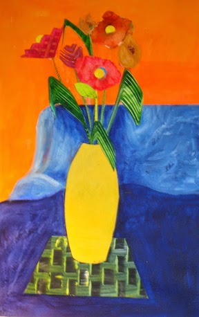
Paste Paper Flowers

     Why is it that, as I graciously age, I like chocolate and bight bold colors more and more?

     As I read and research I am better understanding this warm/ cool color theory thing. I understand that there are warm and cool colors but I was unaware of the warm and coolness within a single color and how combining them affected my art work. Using a limited palette kept coming up in my reading so I am trying it. In the past I had a bucket full of colors and used them as the mood struck me and many times I ended up with a lack luster painting. How did other artists get their vibrant colors? From my reading is seems my biggest problem was mixing a warm color  with a cool complimentary color to tone it down or create a  new color. Results:dull muddy colors. If I had mixed my warm color with a warm compliment color it would have worked! So the theory goes.

     Because I am trying a limited palette, I will only take one warm & one cool red, a warm & cool blue and a warm & cool yellow with me to my open studio painting sessions. This forces me to paint with a limited palette. I also take white and an umber. I do underpainting on the canvas to help the colors vibrate as they peek through.

Here are the color I will be forcing myself to use:
*warm; Cad. Red Light      & cool; Alizarin Crimson
*warm; Cobalt Blue           & cool; Ultra Marine Blue
*warm; Cad. Yellow Med. & cool; Cad. Lemon

There are other colors that can be substituted but for now I only know these colors.

     I have to admit that I get frustrated on some paintings and fall back into my comfortable bad painting habits. At some point my paint brush will catches up to my brain's new knowledge and my art work should improve greatly.

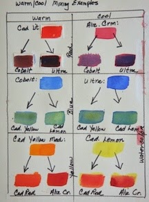
The retired science teacher in me had to give you a visual but in the process the warm/cool color theory did not hold up! First I made a warm/ cool chart using acrylics.
ACRYLIC CHART
I could not see the dull color when I mixed the warm with the cool compliment. The only color that looked dull was mixing ultra marine blue with cadmium yellow.

Next I will try a chart using watercolors; maybe that will adhere to the color theory better. I do realize that I made no attempt to determine equal amount of paint that were mixed together; I just slapped it down to see what happens. I see a difference in the colors produced but I don't find them to be muddy whether I mix warm to warm or warm to cool colors.

Nice try Eclectic Artist!

Please advise me; what is the problem?
   
WATERCOLOR CHART


Sunday, June 29, 2014

ART ON THE ISLAND 3D ART SHOW

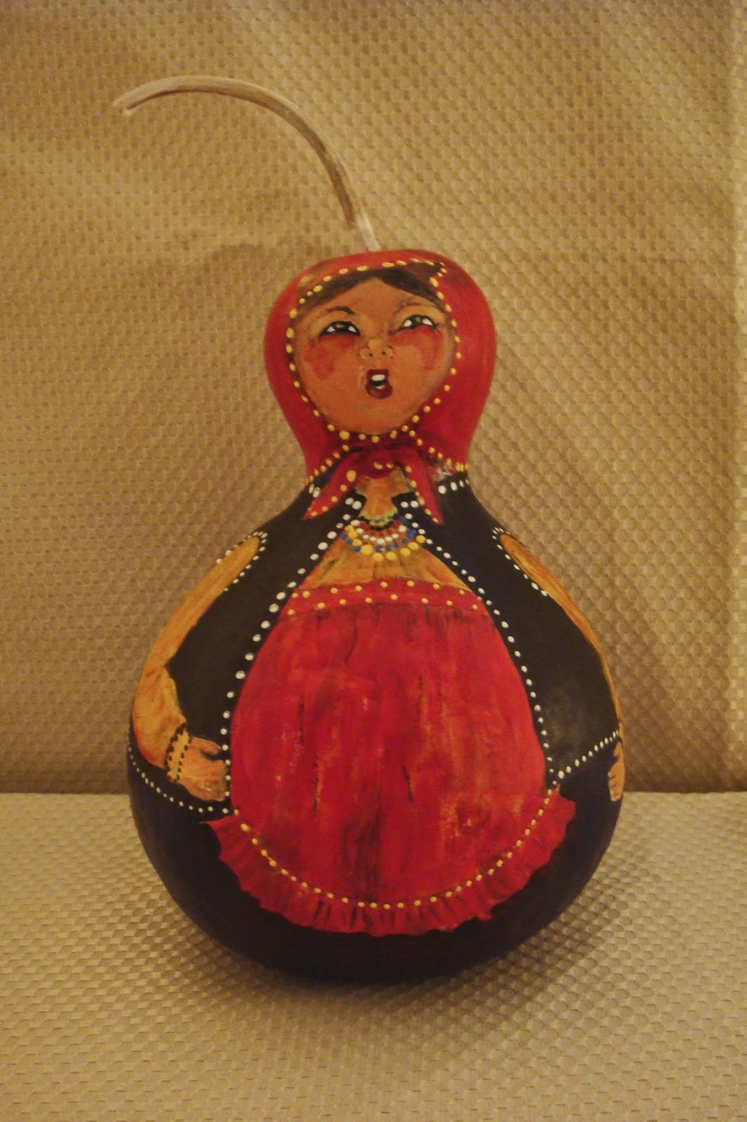
Singing Russian Peasant 
Most of my artistic time is spent painting on paper or canvas but I will make an exception to enter a piece in the Art on the Island 3D Art Show. The Vero Beach Art Club is sponsoring a brand new venue on Marsh Island on February 13-14, 2015 and I want to be part of it. In fact all 2D club members are welcome to think outside the box to create 3 dimensional art work.


Russian Peasant Doll
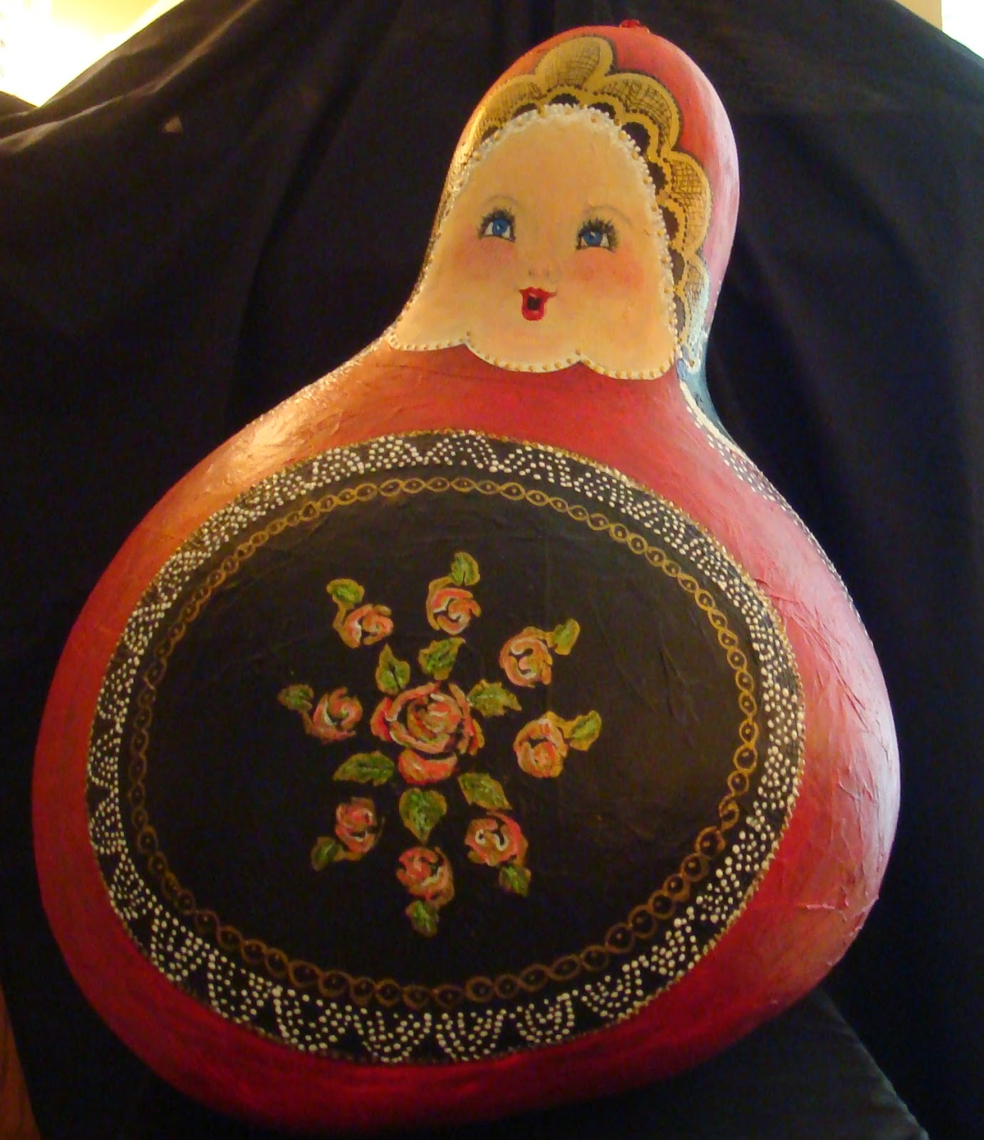
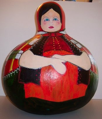
I have painted large 23 inch gourds before and sold this Russian Peasant Doll at Art by the Sea.   The first three photos are  examples of my past adventures and to the right is my Russian Nesting Doll.


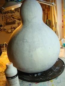
First the gourd is cleaned, sanded and uneven spots are filled in with  dry wall  paste which is dried over night. More sanding with at least two coats of gesso to produce a good painting surface. Without the white gesso base the colors turn out dull and muddy looking.
Now this does not scream gorgeous but wait until I spend hours of painting bold color details onto it. Wish me luck at the ART on the ISAND  Art Show!


file:///Users/maryellenkoser/
file:///Users/maryellenkoser/Desktop/DSC01159.jpgDesktop/DSC01159.jpg

Sunday, June 22, 2014

MY ART STUDIO IS MORPHING


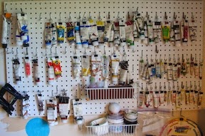
Paint Peg Board 
     Here is a DIY paint organizing system that I found on Pinterest "Art Studios".  In the past kept my paints in a box or drawers in my studio which was really inefficient. It took too much time to find the color I wanted while I was in the zone painting and I did not realize how many tubes I had of any one color. Now I see what I have and I see what I have too much of. 

      Presently the acrylics and watercolors are divided into warm and cool colors but my next goal is to subdivide the colors into warm vs cool within each color. I am trying to understand color theory better by discerning a warm red vs a cool red, etc. Slowly I am beginning to understand where all the mud came from; I did not realize that toning down a warm red with a cool blue equals mud whereas toning down the same warm red with a warm blue would work.

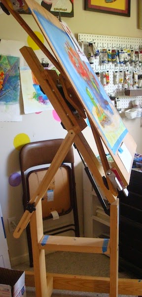
     I wrote a long time ago about my windmill easel and finally I have the time to really use it. The drip method and turning my paintings around at all angles is part of my process so this  invention makes it easier. I thought about buying it for years then finally swallowed my trepidation about making such a big purchase for little ol' me. 

     It takes up a lot of space in my small bedroom studio but I'm glad I splurged.
Windmill Easel


Monday, June 16, 2014

A SMALL CREATIVE SIDE TRACT

 Every little girl loves to play dress up!

      Each morning I peruse Pinterest as part of my cup of coffee and relaxing in PJ's  routine. I saw a darling idea for my little 4 year old granddaughter; costume aprons.
How brilliant is that?
She can whip on an Anna costume from Disney's Frozen and dance to the music for her family's viewing delight.
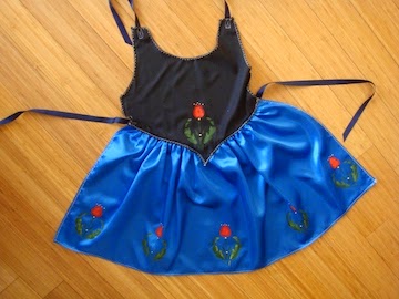
ANNA
     First I had to research what Anna looked like so off to Google. Next to the fabric store where I found a pattern for the costumes but I was not going for anything that elaborate or expensive. The pattern gave me the picture I needed to buy the look alike fabric but I was not about to pay nearly $20 dollars for that, I returned it to the pattern display when I got what I needed. My shopping cart in tow, walking up and down the isles looking for the cheapest fabrics that are just the right colors and sparkle. Found it all; what a good grandmother am I.

When I got home I laid the fabric out on the kitchen counter and began guessing where to cut and where to sew. I enjoy making things without a pattern. Anna's dress had beautiful flower details on it so I pulled out an old stencil pattern book and cut out the pattern with cuticle scissors then  stenciled the flowers onto the bottom of the dress. 

If you ask me I think it is stinking cute. 

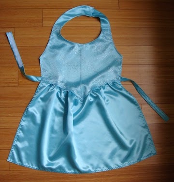
I also bought material for Elsa and I am off and running on that costume apron.
DONE!
ELSA


Thursday, June 12, 2014

TWO STEPS FORWARD


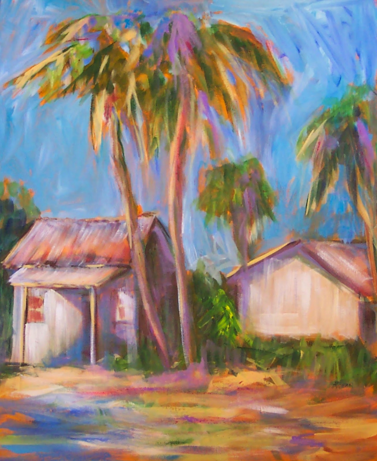
OLD FLORIDA

     Yea Team, two steps forward toward my goal of seriously marketing my art work. Step one; Via Vista Print I ordered  business cards using the above picture which I think represents my style of realism. The painting is titled "Old Florida" and it sold at the 2012 Under the Oaks Art Show.

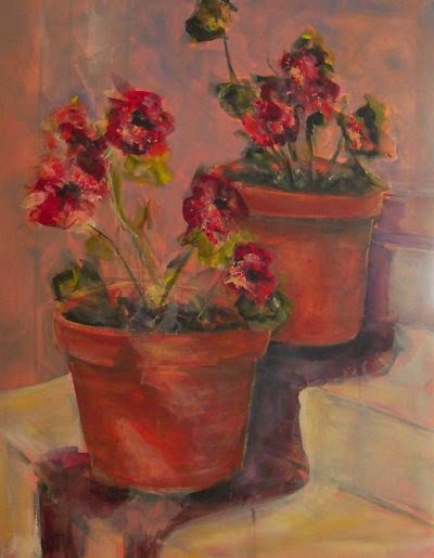
GERANIUMS
The other painting that I was considering for my business card was "Geraniums" which is in a private collection in Vero Beach. Somehow I thought the Old Florida made a better looking business card.


StepTwo;The first Friday of each month is Art Gallery Stroll in the 14th Avenue Art District of Vero Beach. Every now and then I join a friend or two and roam from gallery to gallery garnering ideas and visiting with people.  These strolls are good for the artistic soul.
There is one gallery in particular that I enjoy; Artist Guild Gallery, which is a cooperative gallery of about 20 artists. My goal was to finish being president of the Art Club and then devote time to being an artist. Brave little soul that I am, I asked for an application to apply to be a full member of the Artist Guild Gallery. After I fill out the application I will present 3 paintings that represent my style of art work which we all know is quite varied. Thought I would show an abstract,  a realistic one and a mixed media work.

Wish me luck and I will report back the results.  If they say no thank you to me I know that I stepped up to the plate, gave it my best shot and that I have the right to fail with honor.


Friday, June 6, 2014

Eclectic Artist Web Site to be announced in September of 2015

     This September I will be introducing my Web Site on the Vero Beach Art Club Artists Gallery web page which is available to all club members.

The web site address is : www.artistsgallery.us

     The categories of my art work fall into many genre; abstract, realism, impressionistic, abstract expressionism, mixed media, whimsical, large gourd doll 3D art, and thus the name Eclectic Artist. If you read far enough back in my blog articles I had previously used the title, "The Painter Within" as my blog name but I did not feel it represented the variety within my art work. I feel the name "Eclectic Artist" will better encompass my wide range of subjects/styles and cover any paths I choose to follow in the future.

     I have been painting, going to open studios, watching art videos and trying to maintain completing a painting a day. That's pretty good for adhering to the goals I had set for my self but I did make one change and that was to lighten up on the daily painting into just do some painting each day. A finished painting a day put too much pressure on my schedule and I was not enjoying the process.

     I have also been busy finishing paintings that I started a long time ago plus matting and framing art work so they are ready for sale. I had forgotten how much time it takes to complete a final product so that counts as working on my art.

Here are two of my latest creations:
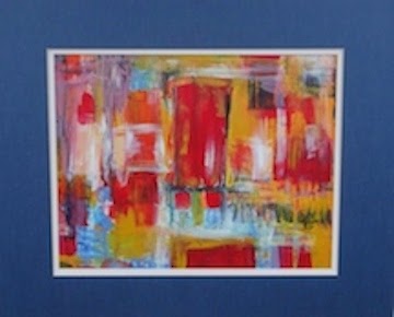
CITY LIFE
Once again the dichotomy of my work shows up.
I like it that way!

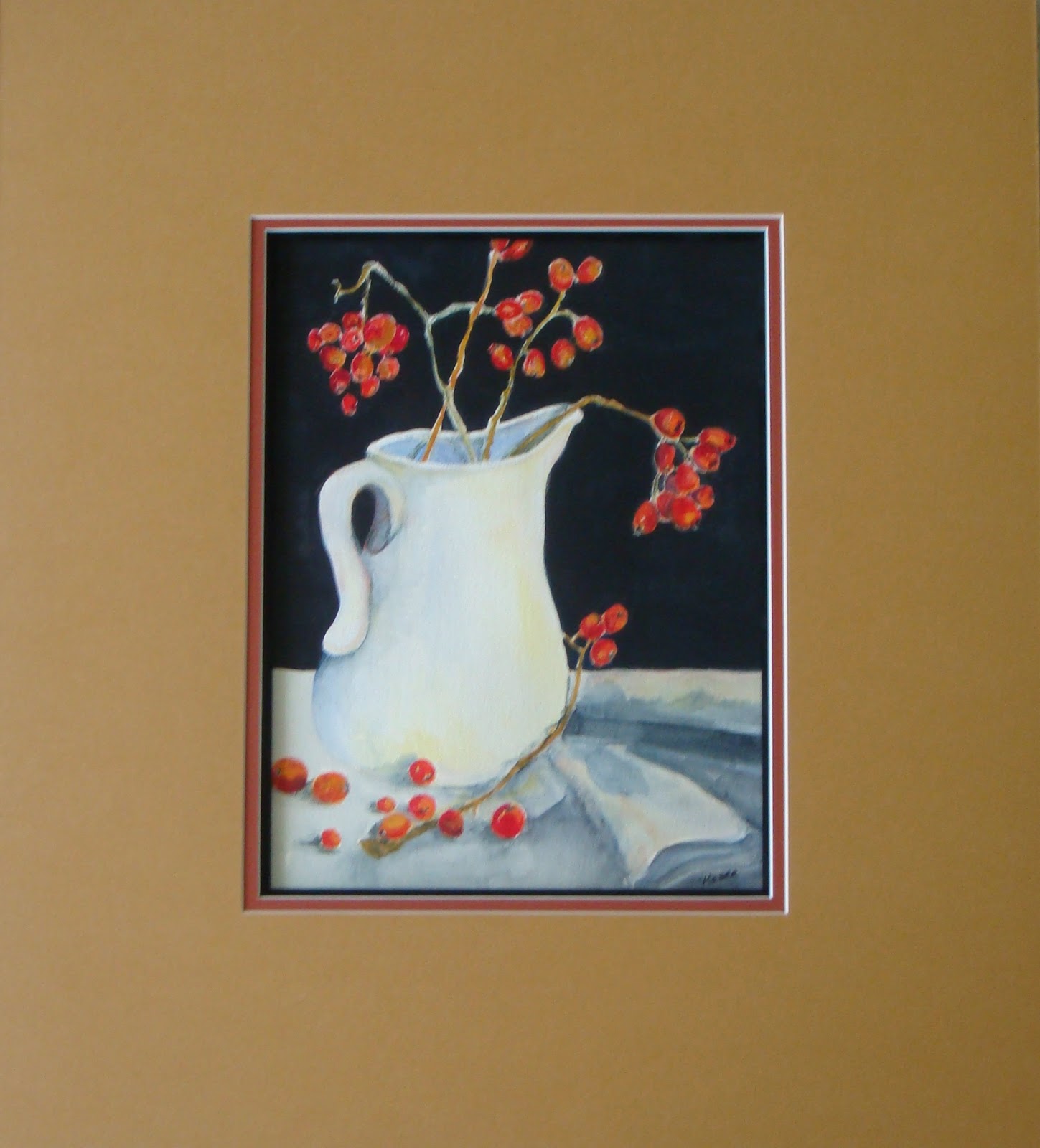
BITTERSWEET