Sunday, July 26, 2015

THE COLOR CONUMDRUM

My instructor felt my weak area was color so I bought Betty Edward's book on Color which I am reading and doing the lessons page by page.

I made the color wheel, value wheel, color surrounded by a neutral and now I am working on color harmony.

Taking a piece of illustration board I taped off the edges, found a designed fabric that I liked, photo copied the fabric and traced the black and white design onto the board.
Fabric

B/W photo copy

Traced design.
Next I must divide my 10x10" into 6 sections. Because the design of the fabric is so busy I will choose a simple box within a box design. The geometric shapes are a rectangle so as not to repeat the square design and the boxes were placed off center.

I chose a geometric shapes for my divisions to act as a foil to the organic shapes of the fabric design.
First division 

Second division

Adding fabric sample
Now I have to color in area 2 with all of the colors of the fabric sample matching value and hue. This make take awhile seeing that I chose an intricate design.

I shot myself in the foot with this one.

To be continued.

Saturday, July 18, 2015

STUDIO PINK

PINK
Three years ago my husband and I adopted our 7th rescue dog. I would like to introduce my art therapy dog & my studio helper; Pink. No, we did not name her but it fits her with the inside of her ears and her belly as pink as can be.

Music on, canvas primed and a painting we will go.

I am trying to develop my own style and at the same time learn from other artists such as Lisa Daria and Carol Marine. I watch the U Tube videos, read their books and practice their style but where is my style? Next I will read Betty Wade's Color Theory and then put the books and classes aside and just paint.

This is the part where I give myself a pep talk and say; one painting at a time, be confident that the answers will come and maybe relax.                

 Pink, what do you think?
"You talking to me?"


BOUQUET 1
I am analyzing what needs to happen to complete this daily painting. I like the negative painting on the flower the best, the vase needs to be grounded so it does not float on the canvas, the background is too similar to the vase color in hue and value, etc.

That will give me something to work on. I do find the camera to be a useful tool to see my mistakes.

BOUQUET 2
Did you notice how I changed the background and totally lost my flower focal point. I still need to ground the vase and on top of that improve the flowers. I hate it.

 Don't waste paint just slap it all onto the canvas to cover up what displeases you.

FRUSTRATION
Me thinks I am not a floral painter!

Saturday, July 11, 2015

YOU TUBE IS MY FRIEND


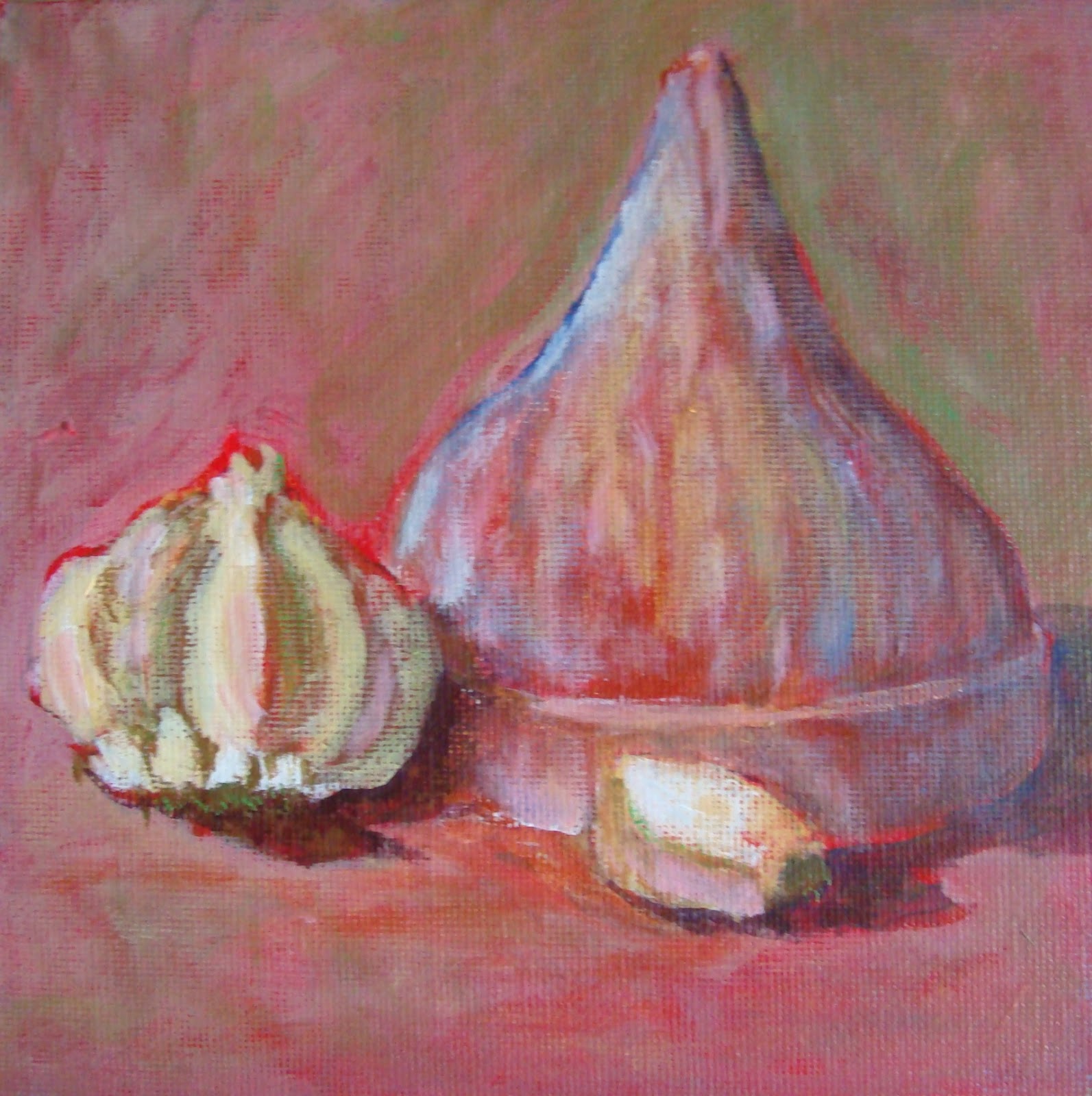
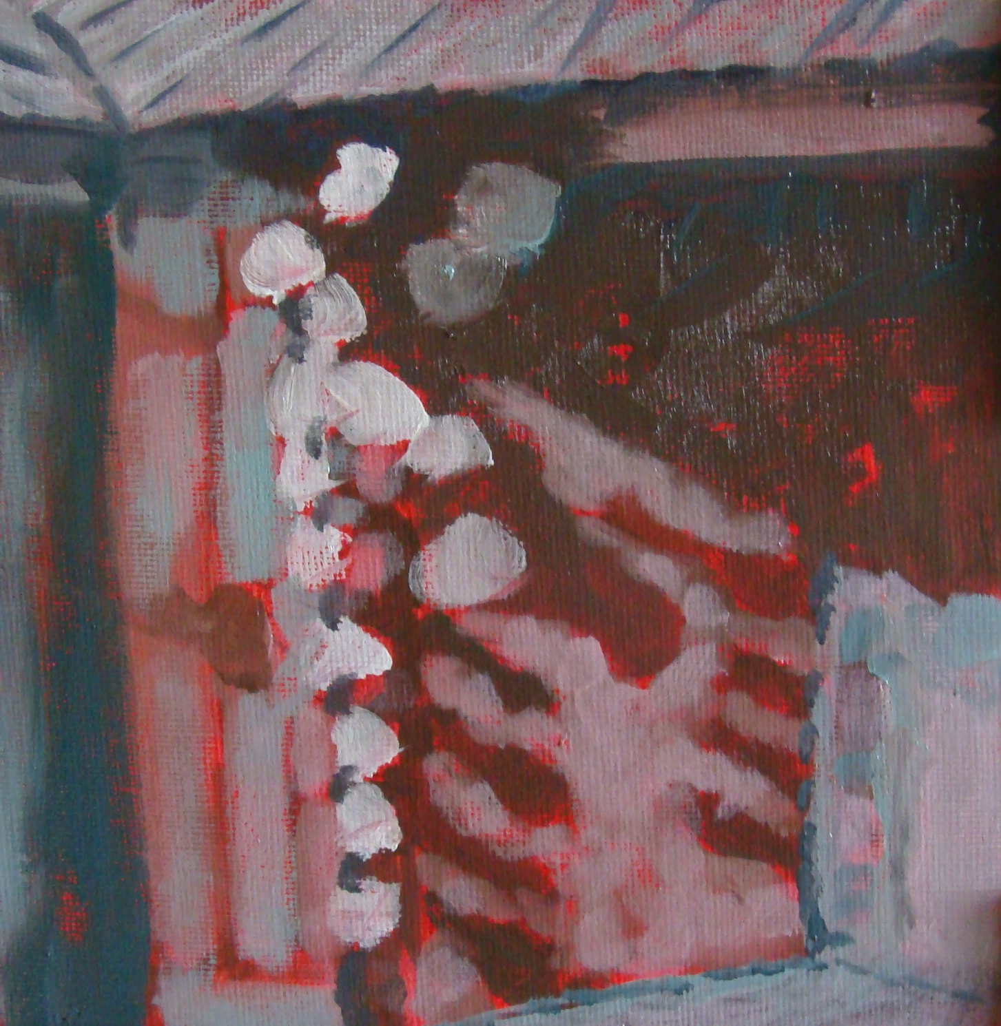
I am an audio visual learner so to see and hear someone paint a picture is ideal for me. At the moment I am enjoying Carol Marine founder of the Daily Paint Works web site. I just finished viewing her demo of three white cups and an orange.

Learned:  *a small color shaper is good for signing paintings
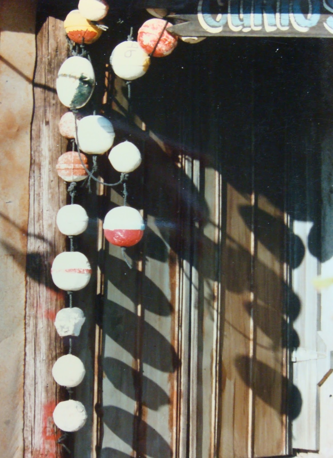
                *elipses have a slight tilt to them
                * paint your strongest color (island) first
                *use a white palette as a comparison for your lightest (highlight) value,
                  all other colors should be darker in comparison to the white of the palette.
                *mix the harmonious colors on the palette first. The warms, cools, lights, darks and neutrals
                  can be worked out on the palette before painting. That way you know if they look well
                  together.
                * use as few strokes as possible
               * use the view finder with a live still life

OK, I need to work on placing my strongest color first, comparing values to the white palette and most of all; mixing harmonious colors on the palette first! Also use as few strokes as possible.

Normally  I have so many brush strokes and layers of corrective paint that I should sell by the pound.
1
2


3
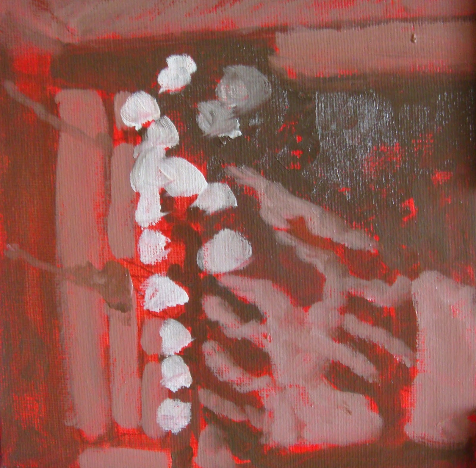
Cup with Bittersweet

Friday, July 3, 2015

Schools Out for the Summer

I would like to introduce my friend and my teacher;
Karen Leffel Massengill

There were two other students but I did not get their photo before they were off for northern climes. Luckily I did get Tom's picture, he paints four times a week at different studios and classes. 
Tom


 Karen demoed how to do clouds and water to help Tom on this painting. Of course I learned too because I am not a strong landscape painter and I want to be.

Warm/ cool colors, variation, soft/ hard edges, color choice and blending plus knowing where to use it all.

So much to learn!
Tom's masterpiece.

Sunday, June 28, 2015

ART BOOT CAMP Lesson #4

I did this as homework for my last class with Karen. Thought it was simple, had good value changes and I thought the composition was appealing.
#1
I tried painting a cool green background then painted my subject; it looked awful so I painted over with a bright red. Details added, it still is missing something. I will show Karen and see what I can do to punch this up a bit. I do like the garlic but the ceramic garlic baker is a bit lack luster.
#2


Karen suggested trying a cool darker background to see which color improves the design. She liked the foreground but thought it needed more temperature color changes to emphasize the shape and cast shadows of the subject.

#3

I do find that I am impatient with the time that it takes oil paint to dry.


The final layer was done with a palette knife and I darkened the values quite a bit.

Garlic- finished

Sunday, June 21, 2015

ART BOOT CAMP-Lesson #3

      Today we tackled simplifying a personal photo (or any subject matter) to determine the 3-5 values and to reduce the number of shapes to no more than 12.

     Here Karen is demonstrating her photo under tracing paper which acts as squinting the eyes would to see the proper values. She set aside three marking pens; black, middle gray and light gray letting the white of the tracing paper acts as the lightest value. As she colored she would edit out details to make a balanced design instead of adhering to every last detail of the photo.

Next Karen numbered the shapes reducing detail to stay under 12. After that she had a composition that will be paint brush sketched onto her canvas and off she goes painting knowing that her design will make a good work of art.

              
Photo
Tracing Paper

Red base coat on the canvas
Now it is my turn.                    
#2
#3
Final Product:


FISHING NET FLOATS

Saturday, June 13, 2015

ART BOOT CAMP- Lesson #2

RED BOARD
BLUE BOARD

I have no patience for making color wheels and value/temperature charts and thus I never progress beyond "do it my way".  Karen's art boot camp is gently forcing me to do my homework and I do see why it is important to do the charts, etc.

Put a good teacher in front of me and I will willingly learn.  
                                                         
YELLOW BOARD
ORANGE BOARD
First we made a black to white value scale on six color boards. Each primary color will be lightened or darkened to match the value at the top of the chart. As I squint my eyes the values should slide down the chart as an equal value to the top black /white scale. This took time and patience for me.

We are doing temperature change as well as value change on the same chart we added a cooling or warming second color to see what tones it would produce. My biggest weakness is value change so I accepted the challenge. Did my homework; I am so proud of me.
GREEN BOARD
PURPLE BOARD
 Oh my this took a long time plus I was getting used to using my new beginner set of oil paints.

There better be a really big prize in my next Jacker Jack box to reward me for this assignment!!